A bit unusually, I’ll start with the conclusion – if you have a passion, you’ll find the time and means to learn and get closer to your objectives. Always. That will help you grow and be more happy as a person.
In my case, my interest for air quality drove me to find some accessible hardware to get the data, remember some of the Linux concepts while learning new ones, discovering more about Python and Pandas for data analysis, adding some visualisation on top with Plotly.
Was it easy? Not quite, it was quite frustrating for a rusty Java developer to adapt to Python, to learn to compile QuestDB on ARM, to use Docker on small machines, to understand that not all SD cards are the same when you perform a lot of writing on it with Raspberry Pi, to find out that remote development with Visual Code is not supported on all Raspberry Pi (on older CPU architecture like Pi Zero for example) and work with scp to move things around on two Raspberry Pi. My experiment is just the start and not the end of the environmental data analysis, I’ll continue to improve the solution – so many ideas pop into your head when you stay in the flow. I’d encourage anyone to find their passion (or interest for something) and allocate time for it .. you’ll learn a lot, about new concepts and eventually about yourself. Enjoy playing and learning!
I’ve been always attracted to measuring things, trying to understand things around me in quantifiable ways, draw some trends and create some sense from the information available. Maybe that’s just human (to some extent), trying to have a more predictable evolution and more control over what’s going on … but, let’s not dig into the “why am I doing that?”, let’s embrace the curiosity of finding solutions for the questions regarding the environment we live in.
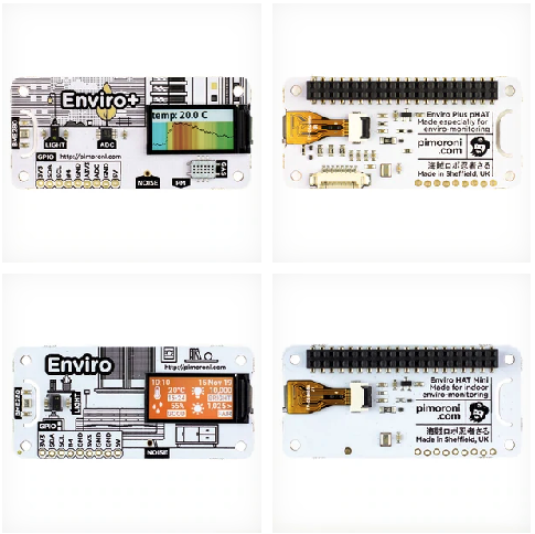
Some time ago I found out about a nice piece of kit, which was putting together an array of sensors designed to measure the key indicators of the environment (indoor or outdoor) – the Pimoroni Enviro+. In the meantime, another “lighter” version was released – the Enviro – designed apparently for indoor monitoring.
More details about the kits are available here, you can also purchase them directly from Pimoroni.
Enviro + Air Quality features
- BME280 temperature, pressure, humidity sensor (datasheet)
- LTR-559 light and proximity sensor (datasheet)
- MICS6814 analog gas sensor (datasheet)
- ADS1015 analog to digital converter (ADC) (datasheet) *
- MEMS microphone (datasheet)
- 0.96″ colour LCD (160×80)
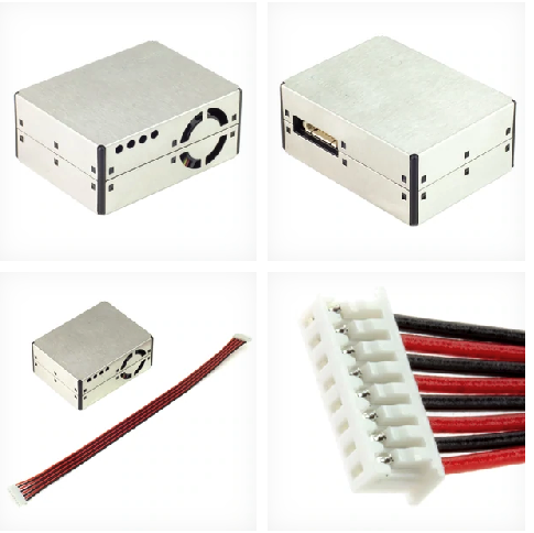
- Connector for particulate matter (PM) sensor (available separately)
- Pimoroni breakout-compatible pin header
- pHAT-format board
- Fully-assembled
- Compatible with all 40-pin header Raspberry Pi models
- Pinout
- Python library
- Dimensions: 65x30x8.5mm
Enviro features
- BME280 temperature, pressure, humidity sensor (datasheet)
- LTR-559 light and proximity sensor (datasheet)
- MEMS microphone (datasheet)
- 0.96″ colour LCD (160×80)
- Pimoroni breakout-compatible pin header
- pHAT-format board
- Fully-assembled
- Compatible with all 40-pin header Raspberry Pi models
- Python library
- Dimensions: 65x30x8.5mm
I also purchased with the Enviro+ the PM sensor (available here) and connected them to my Raspberry Pi Zero W, which was matching perfectly the size of the Enviro+.
I installed the Raspberry Pi Zero W with the Enviro+ and the PMS5003 outside, protected from the sun and rain/snow, 3 meters from the surface, connected via WiFi to my routers mesh (that’s why I preferred the Zero W).
The Python library comes with a large set of examples, allowing you to understand how you can access the sensor data and collect/display it on screen. So the task of putting together the pieces and using them to get an understanding of what is around you in terms of air quality seemed fairly easy.
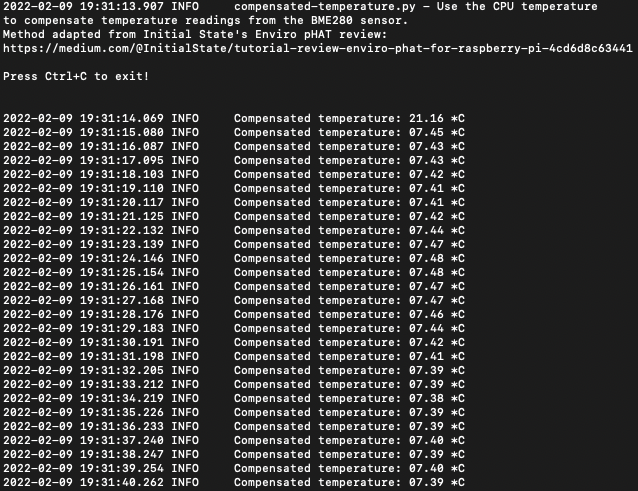
One of the challenges when you work with sensors is related to their accuracy and with Enviro+ things are no much easier than with the others. Thus, the need to compensation for temperature, since the design of the pHAT makes it close to the Raspberry Pi which also emits some heat, affecting the measured value. An option is to use a GPIO extension cable which allows you to separate the Enviro+ from the Raspberry Pi and eliminate the need for temperature compensation (which has it’s limits). I didn’t and had to accept the limitations of using the BM280 close to the Raspberry Pi. Another alternative for measuring the temperature (and humidity) is connecting an DTH22 (cheap but reliable sensor), but that kind of takes away the idea of having a simple plug-and-play solution with just Enviro+.
So, let’s say that with minimal effort you can collate some of the sample code provided by Pimoroni with their Python library and create a solution that’s able to get all sensors data and display it somehow – console or LCD display. Since I was installing the sensors outside, 3 meters above ground, I didn’t care that much about displaying data on the LCD screen, but for inside monitoring, that might be a nice solution.
One challenge was to make use of the MEMS microphone – which is advertised as being able to support the noise level measurement – but the library doesn’t offer direct support for getting the dB SPL – you can get a visual guide of the signal amplitude on three frequency ranges, but nothing simple just saying “this is the noise level in decibels”.
I had to dig into some work done by other people and I found some good work done by Ross Fowler, who developed and environment monitor project using the Enviro+. The project is available here https://github.com/roscoe81/enviro-monitor and also includes some work on the noise detection https://github.com/roscoe81/northcliff_spl_monitor. Starting from that work (thanks Ross!), I was able to create a “noise collector” solution, which is getting the sound pressure every 30 seconds and stores it for further analysis.
Since I was not interested as much in displaying the data on the LCD or on my terminal, the next step was identifying the best way of storing the information collected for further analysis.
One option I took into consideration was storing the data in a local database like sqlite, which doesn’t require a lot of power, but also this didn’t fit very well the idea of accessing and consuming that information from other apps. Then I turned my attention to time series databases, because those were very well fitting the data typology.
I looked over several options:
- InfluxDB (https://www.influxdata.com) – one of the reference time series databases, with good Python support
- OpenTSDB (http://opentsdb.net) – one alternative, I didn’t see that as easy to use on low power devices
- VictoriaMetrics (https://victoriametrics.com) – good solution for low power devices, especially since it supports the InfluxDB Line Protocol (and other protocols) – unfortunately the documentation was not that clear (to me at least) on how you could use the InfluxDB protocol to send data from Python. I felt like VictoriaMetrics was much more adapted to collect metrics with agents rather than getting data from a custom python code.
- QuestDB (https://questdb.io) – this solution was hitting the sweet spot of being flexible, user friendly and relatively easy to deploy on low power devices. I was tempted to use the QuestDB on Google Cloud, but I decided in the end to install it on a Raspberry Pi 4 (4GB RAM) using a Docker container. And it worked fine, it was easy to send data and especially to view data
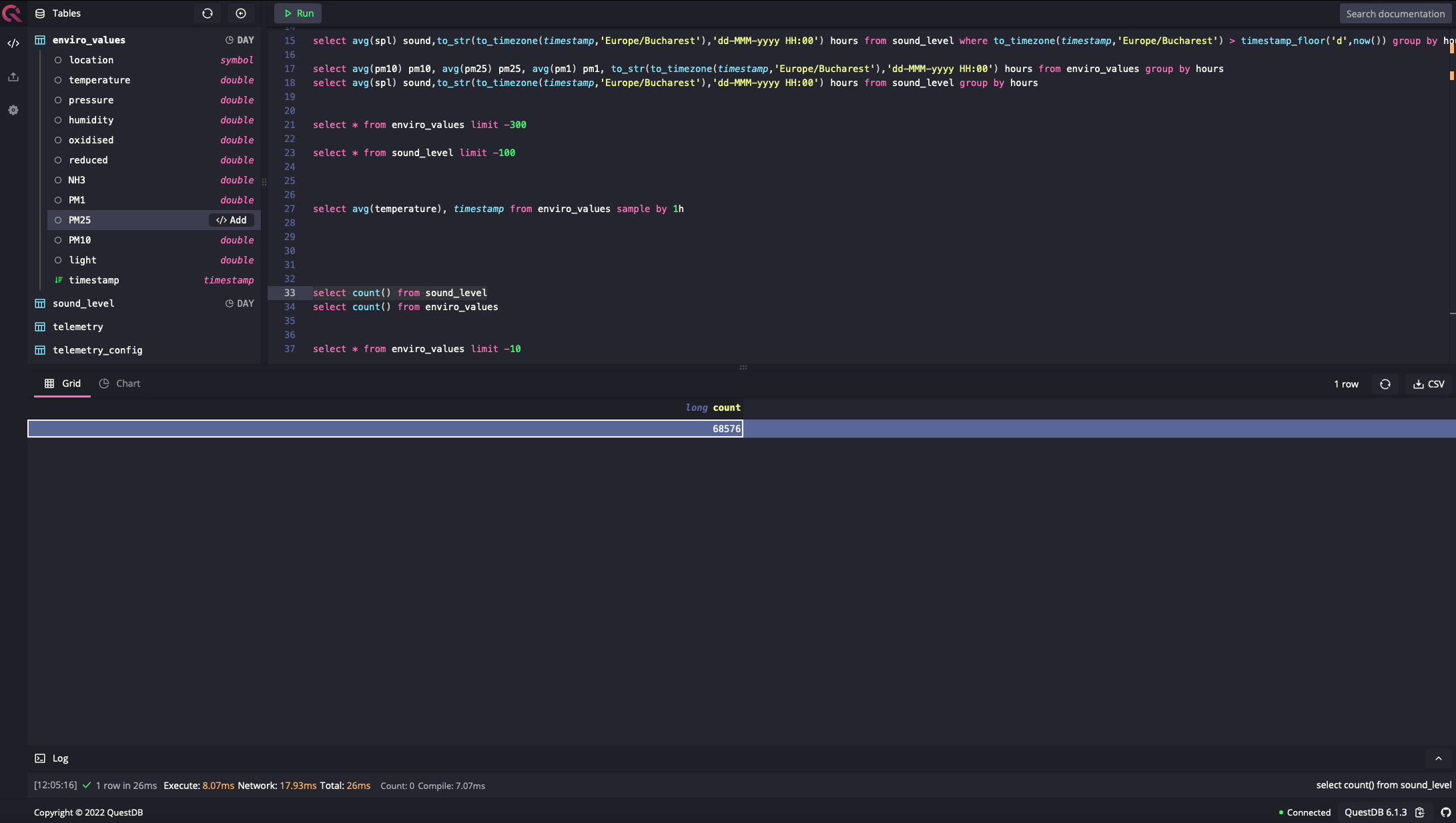
One nice surprise was the build-in chart builder, which allowed you to see the data in an intuitive visual way
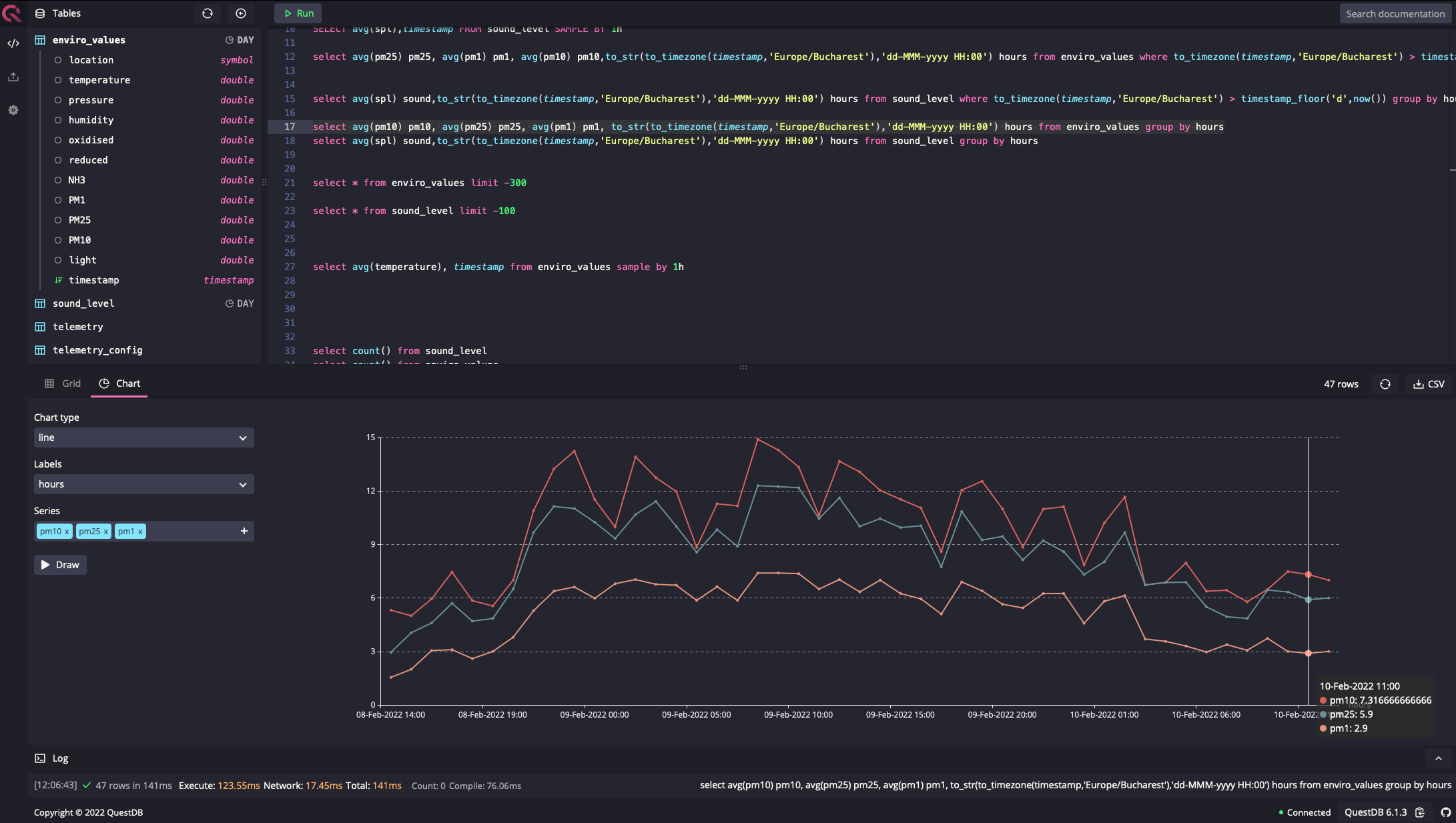
The database is fast and lightweight, and it doesn’t put pressure on my RPi4. QuestDB was a nice surprise, being stable and reliable, but at the same time easy to use. Using Docker on the RPi4 was also a very good and clean solution, allowing good control of the services.
I managed to make sure that the reliability of the solution was decent, the data collectors on the RPi Zero W being transformed in services and not depending so much on the availability of the RPi 4 database. This was a good opportunity to learn more about systemctl and journalctl.
I still need to invest some work on treating exceptions like when the database is not available (for various reasons), the sensor data to be written down locally in files that will be sent eventually in the database at a later moment.
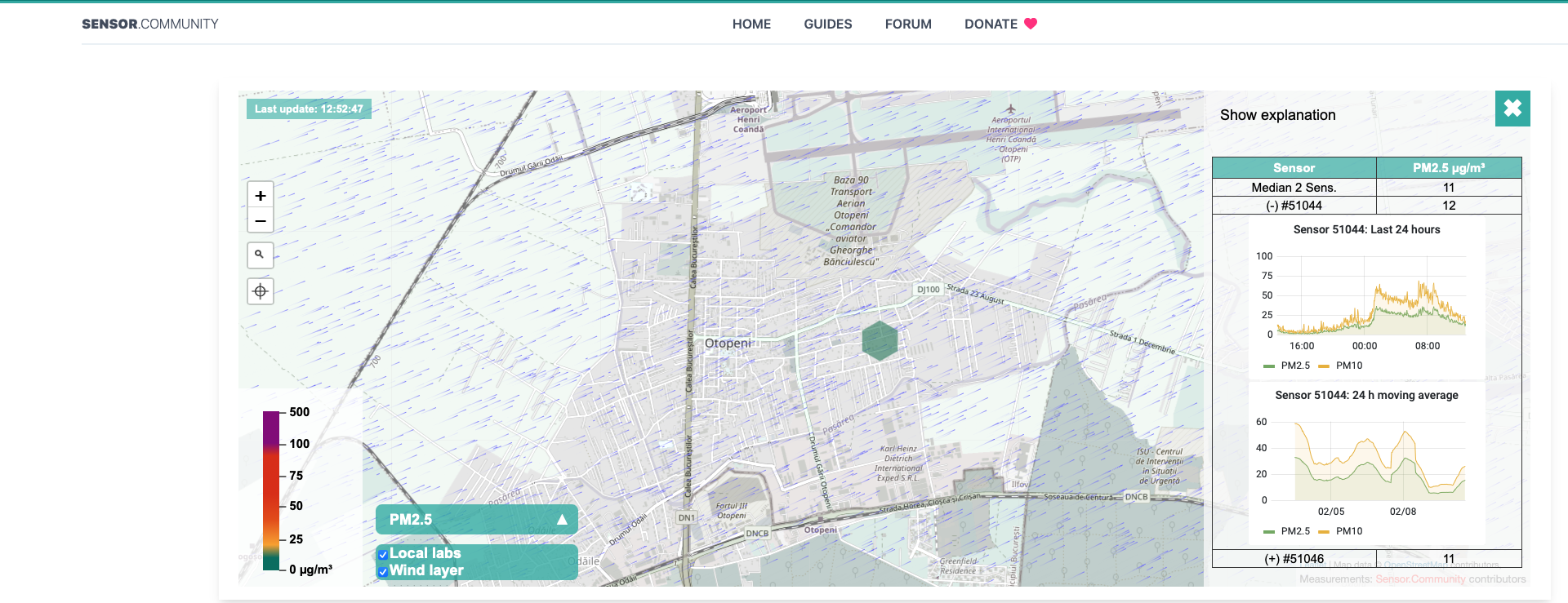
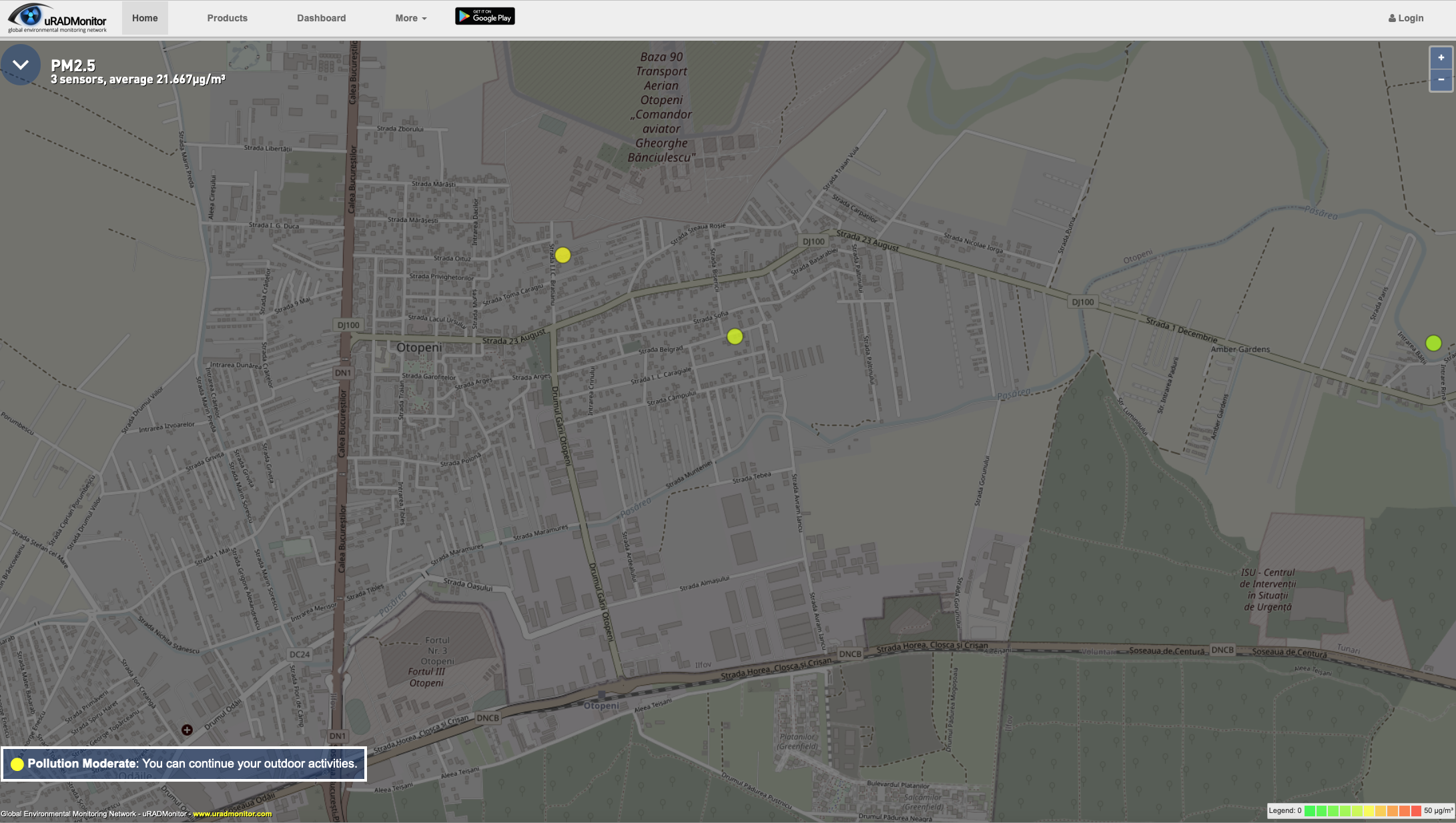
After several days of registering data, I noticed that the values coming from the PMS5003 sensor were constantly high, above 100 micro grams / cube meter for PM10, PM2.5 and PM1 and I had to check against other sources of data available locally (less than 1 km away). I saw at that moment a strange discrepancy…my values were way higher than the others (all of them) and I could not explain that only by the fact that I was in completely different polluted area. I run the particulate python sample code on the RPi Zero and got new values – similar to what the other stations were reporting – less than 10 instead of 120+ micro grams per cubic meter. I had to delete all the data collected in the recent period, because all AQI indexes were just insane because of that. That also raised the awareness of checking from time to time other sources of data for validation. Luckily, I have around some sources of data which are either exposed through Luftdaten or uRadMonitor dashboards.
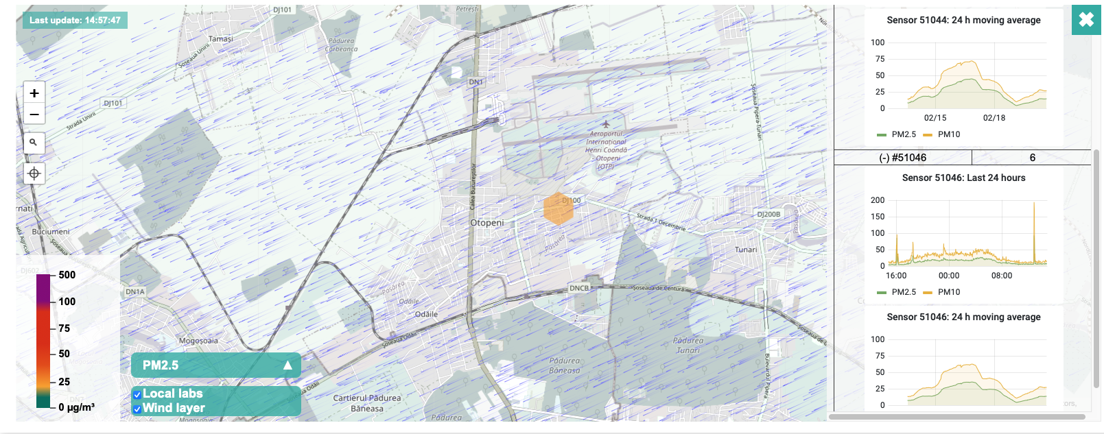
An alternative is to look over the data exposed by the users of uRADMonitor stations – I have two stations in the neighbourhood to check the data against.
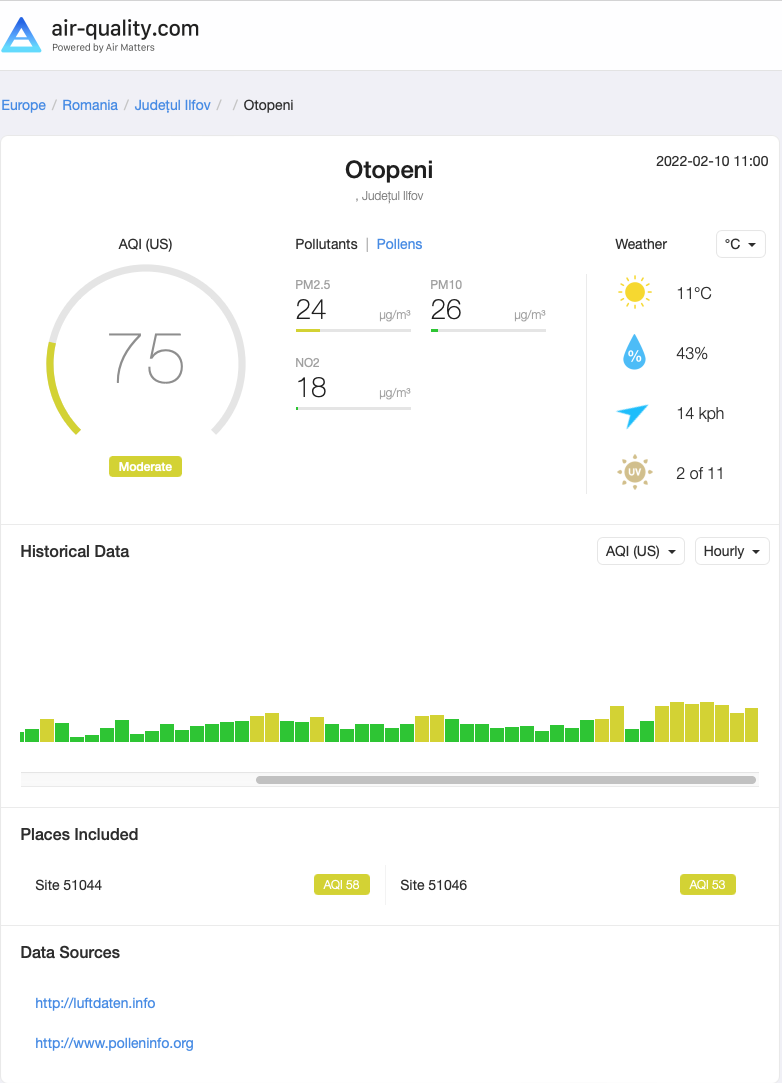
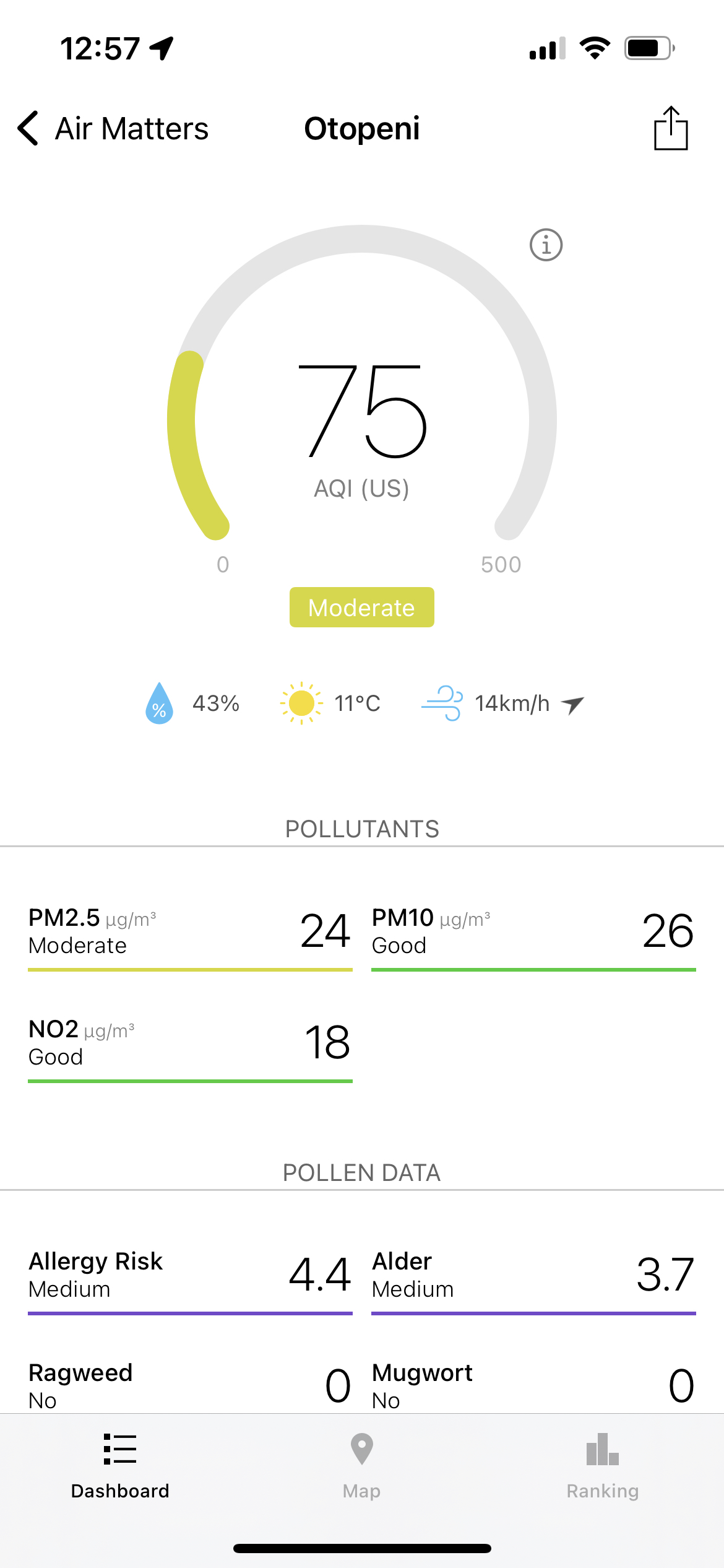
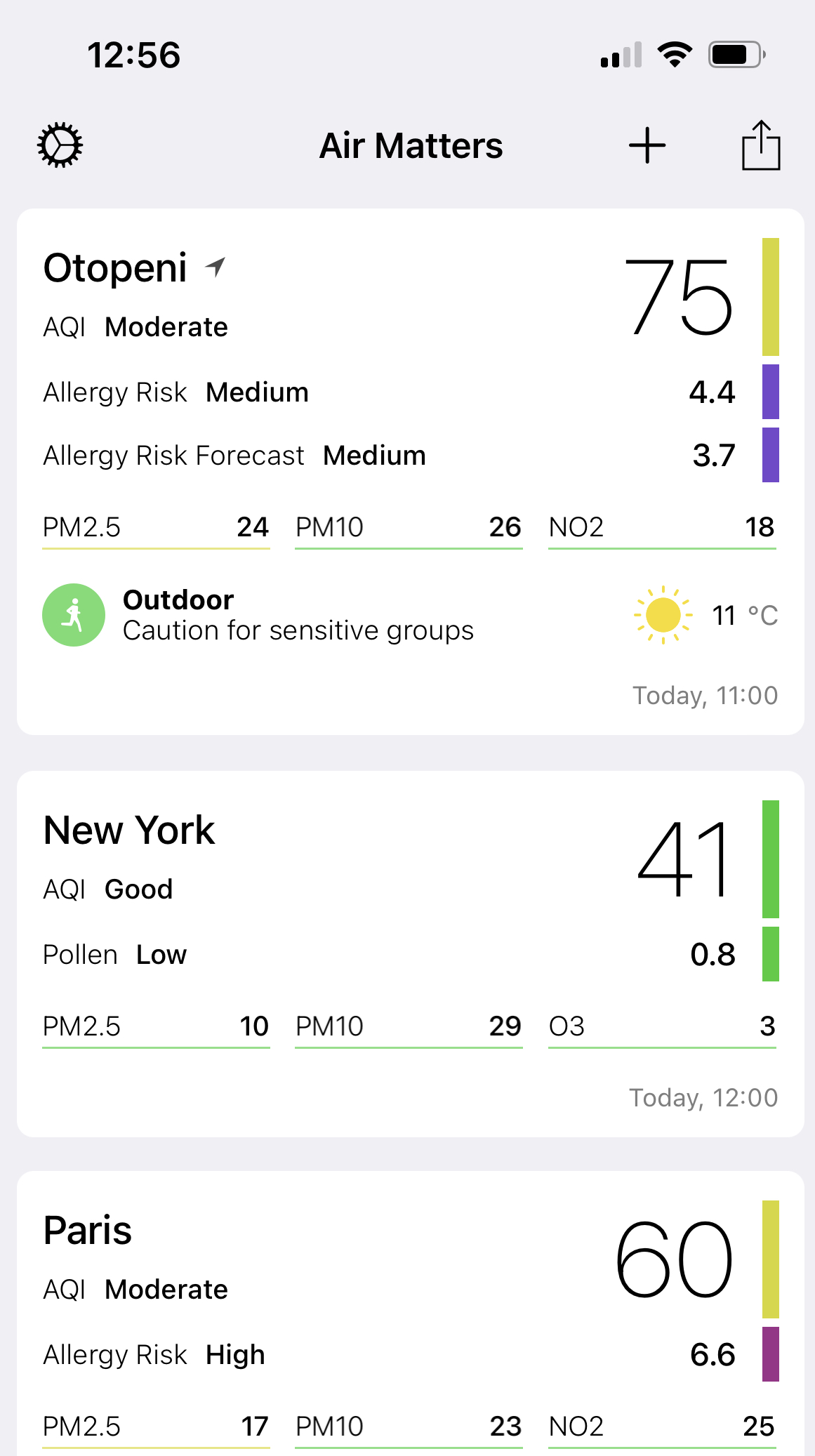
Both systems are displaying “raw data” from the sensors and that’s very useful, another aggregator of information being the app Air Matters, which gets data from different systems and display those into a unified (and friendly) user interface:
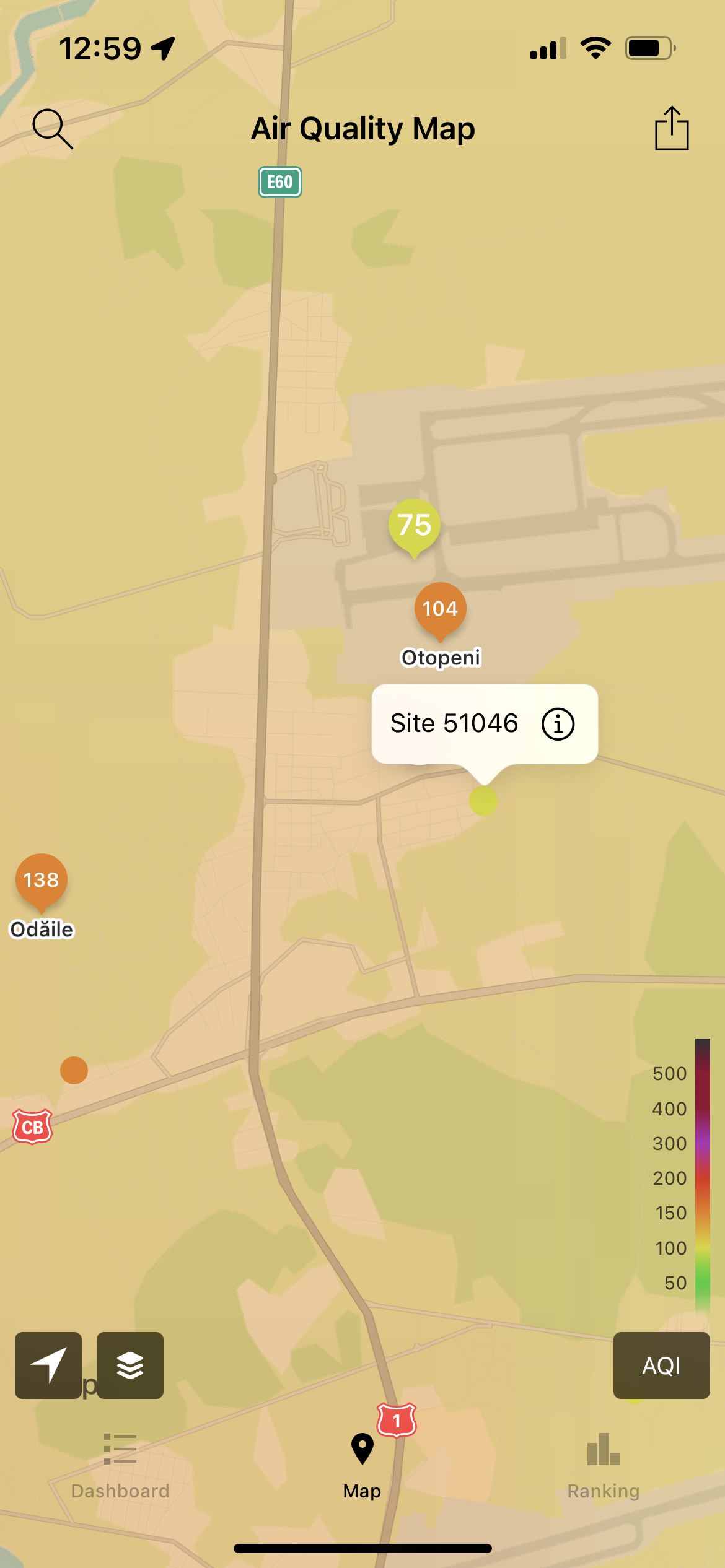
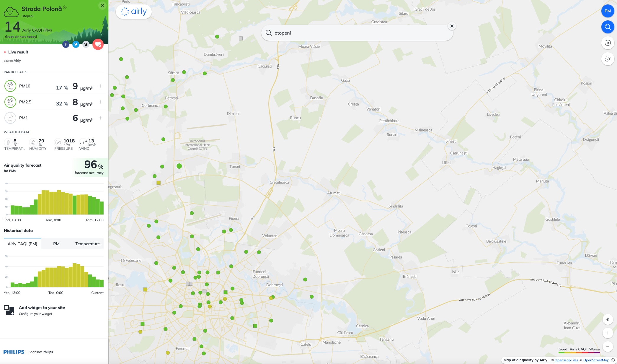
Another option to validate the data is to look over the information the Airly network of sensors is providing, some sensors being available in my town:
Now that we have some data, what can we do with that? How can we easily see what we captured and how can we can make some sense out of it?
One advantage of QuestDB is the fact that it allows a quick interaction with Pandas, just a few lines of code and you have all the information loaded in a data frame. In my case, the database had different IP, but the basic approach is the same.
import requests
import io

# sends the query to QuestDB
r = requests.get("http://localhost:9000/exp?query=select * from enviro_data")
rawData = r.text

# loads the data
pData = pd.read_csv(io.StringIO(rawData), parse_dates=['time'], index_col=['time'])
print(rawData)
For a simple analysis and the volume of data I have at this moment, the approach is easy and acceptable, but it may need some fine-tuning and parametrisation and pagination assuming that you won’t load every time for analysis all the data from several years.
For example, even in my case, loading all data doesn’t make sense, at least for analysing the quality of the air around you can properly use PM10, PM2.5, CO, NH3 and N02 because those type of info are used in the definition of AQI (Air Quality Index – US). What I found out researching options to transform data into a single easy to understand index is that there is some general consensus around the world, but not enough to have a unique index for all countries .. Europe has CAQI, US as AQI, India as it’s own AQI and different companies operating in this area are defining their indexes as well (for example BreezoMeter has developed a specific index in addition to supporting the others).
Now, let’s have a look over the raw data from the particulates sensors, using Plotly express (https://plotly.com/graphing-libraries/) with 3 annotations

During the first period, I was getting stable values (not static, but moving so little in a very narrow band for both PM10 and PM2.5) and that wasn’t validated by the other sources. Looking for answers on the Enviro+ lib community forum, I found out that my approach when reading data from the sensors with pausing the Thread wasn’t the good one, since it allowed the internal buffer of the PMS5003 to be filled in with “old data” and that’s why I was consuming data from the past for a long period of time. I switched to continuous reading and only sending the data to the database from time to time to overcome this limitations. During the last 10 days I had to change the configuration of one of the Raspberry Pi and the second time the configuration of my Wifi, creating “gaps” of data in my database.
That says something about the need to collect data locally and send that asynchronous to the DB when the connection is available – that way, I would be only exposed to power outages, since the devices are not on any UPS. It will come, but it wasn’t a priority.
Now, if we look at the recent period (24 hours) [Plotly has some nice interactive features allowing you to zoom], we can try to understand how were things in the recent hours
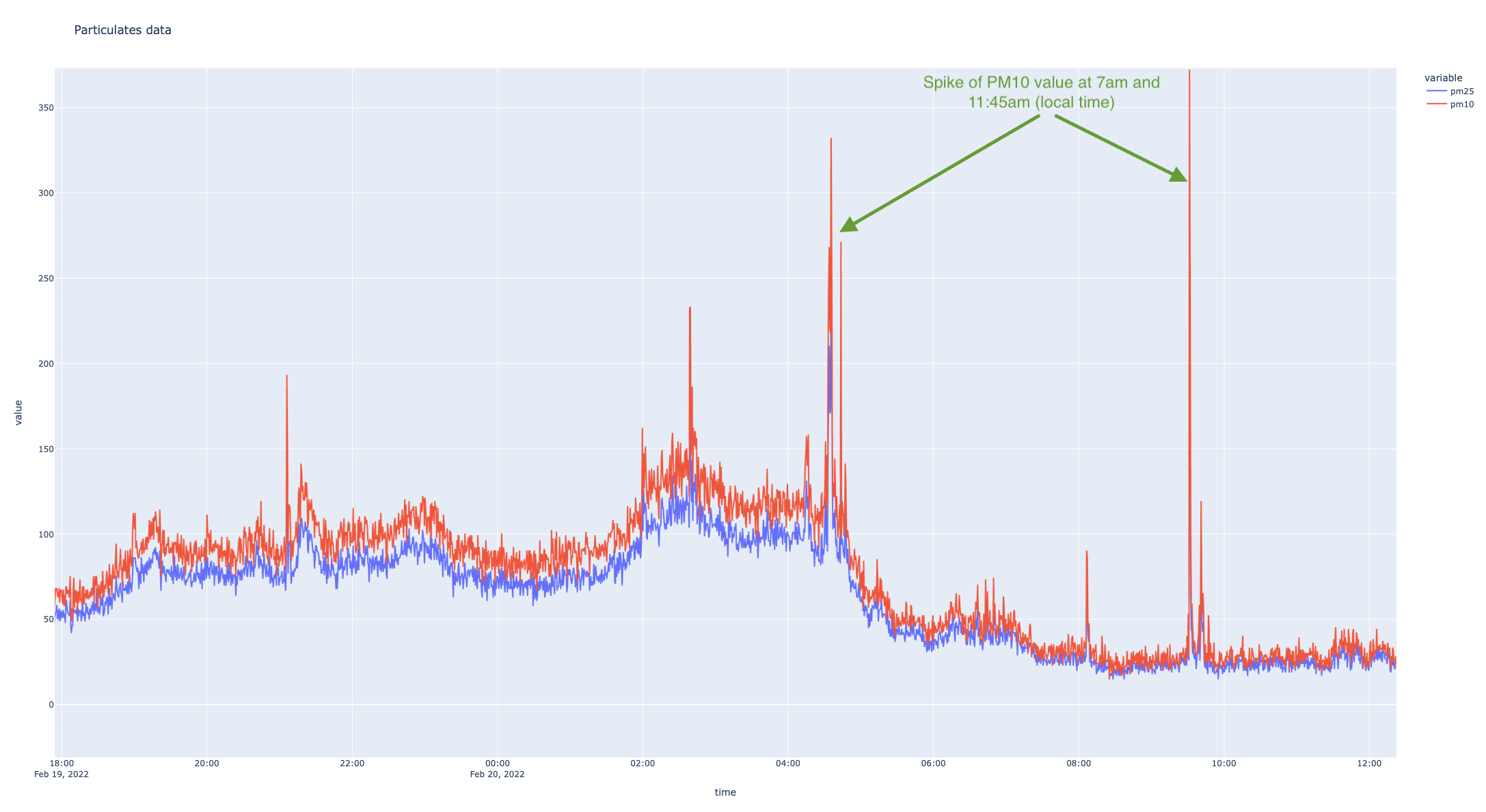
I looked at one of the other sensors around and I can see a spike of PM10 value at 12:50pm (local time), even though the value is not that high (it is 193, compared with my 372), but at least the trends are similar..
Now, what can you do with this values other than looking at the trends…that needs a bit of understanding how the AQI (Air Quality Index are computed, based on the values of individual indices). Actually, the now value doesn’t mean that much, unless you can use that in the context of the values in the last period of time (24 hours). So now, you can start doing some magic with pandas and calculate the rolling mean for different values for the last 24 hours.
pData["pm10_avg"]=pData["pm10"].rolling('24H').mean().values
pData["pm25_24h_avg"]=pData["pm25"].rolling('24H').mean().values
pData["no2_1h_avg"]=pData["NO2"].rolling('H').mean().values
pData["co_8h_avg"]=pData["CO"].rolling('8H').mean().values
Now, we can look at a “smoother” PM10 and PM2.5 evolution

The trend of the values is confirmed by the graphs I see with the other sensor, but the values in my case are significantly higher. Probably, the only way to check those would be adding some more sensors in my yard to check the validity of the captured data. There were some people complaining about the higher than “normal” values read by PMS5003 in conjunction with Enviro+. I also read a study from 2019 published in nature.com that included the PMS5003 and PMS7003 sensors in their research and concluded that PMS5003 can do a decent job and they are suitable for public information. It might be that the Python wrapper on top of the PMS5003 has some issues .. I don’t know, I’ll try to find out.
Now, if we want to look at the AQI values, they are taking into consideration several elements to determine individual indexes for PM10, PM2.5 (surprisingly not PM1 – or not yet), NO2, O3, CO and the maximum value of the individual indexes is considered the AQI value. You can find out more details here.
With Pandas you can do the magic easy enough:
pData["PM2.5_Daily"] = pData["pm25_24h_avg"].apply(lambda x: get_PM25_index(x))
pData["PM10_Daily"] = pData["pm10_24h_avg"].apply(lambda x: get_PM10_index(x))
pData["NO2_SubIndex"] = pData["no2_1h_avg"].apply(lambda x: get_NO2_index(x))
pData["CO_SubIndex"] = pData["co_8h_avg"].apply(lambda x: get_CO_index(x))

pData["AQI_24H_calculated"] = round(pData[["PM2.5_Daily", "PM10_Daily", "NO2_SubIndex", "CO_SubIndex"]].max(axis = 1))
pData["AQI 24H"]=pData["AQI_24H_calculated"].apply(lambda x:get_AQI_bucket(x))
For example the math for PM10 index is simple. Since I’m not a Python expert by any means, I was surprised to find out that the “switch” statement in Python doesn’t exist (like in Java for example) and you need to build it with if/elif/else constructs. Starting with Python 3.10, there will be a “match/case” support that is surprisingly handy for developers.
def get_PM10_index(x):
     AQI_value=0

     if x <= 54:
          AQI_value=round(50 * x / 54)
     elif x <=154:
          AQI_value=round((100-51)*(x-55)/(154-55)+51)
     elif x <= 254:
          AQI_value=round((150-101)*(x-155)/(254-155)+101)
     elif x <= 354:
          AQI_value=round((200-151)*(x-255)/(354-255)+151)
     elif x <=424:
          AQI_value=round((300-201)*(x-355)/(424-355)+201)
     elif x <=504:
          AQI_value=round((400-301)*(x-425)/(504-425)+301)
     elif x <=604:
          AQI_value=round((500-401)*(x-505)/(604-505)+401)
     else:
          print("Insane value of PM10: " + str(x))
     return AQI_value
If we put the AQI into a visual shape it looks like that:
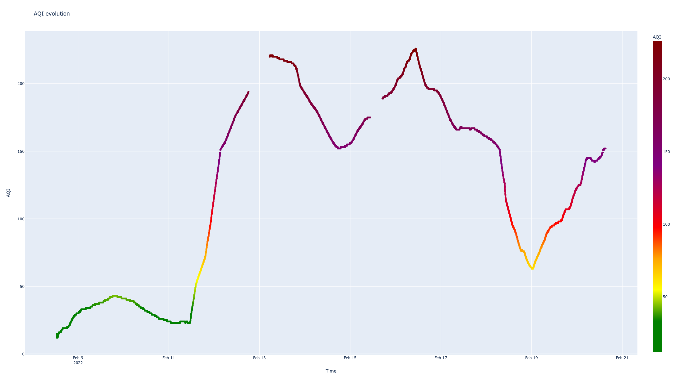
Two aspects are very clear and disturbing at the same time in the graphic above:
- the values are very high [that’s something related to the PM values which are high .. can’t say if those are real or not yet]
- the “gaps” in my data on 13th and 16th of Feb are affecting the graph – that’s the result of using for the graph a color scale which can’t be used (to my knowledge) with line graphs but with scatter graphs
# define the color scale
myscale=[(0, "green"),(0.1, "green"),(0.2, "yellow"),(0.3, "orange"),(0.4, "red"),(0.6, "purple"),(1, "maroon")]
fig = px.scatter(pData,x="time",y="AQI_24H_calculated",color="AQI_24H_calculated",title="AQI evolution",color_continuous_scale=myscale, labels = {
     "AQI_24H_calculated":"AQI",
     "time":"Time"
})
fig.show()
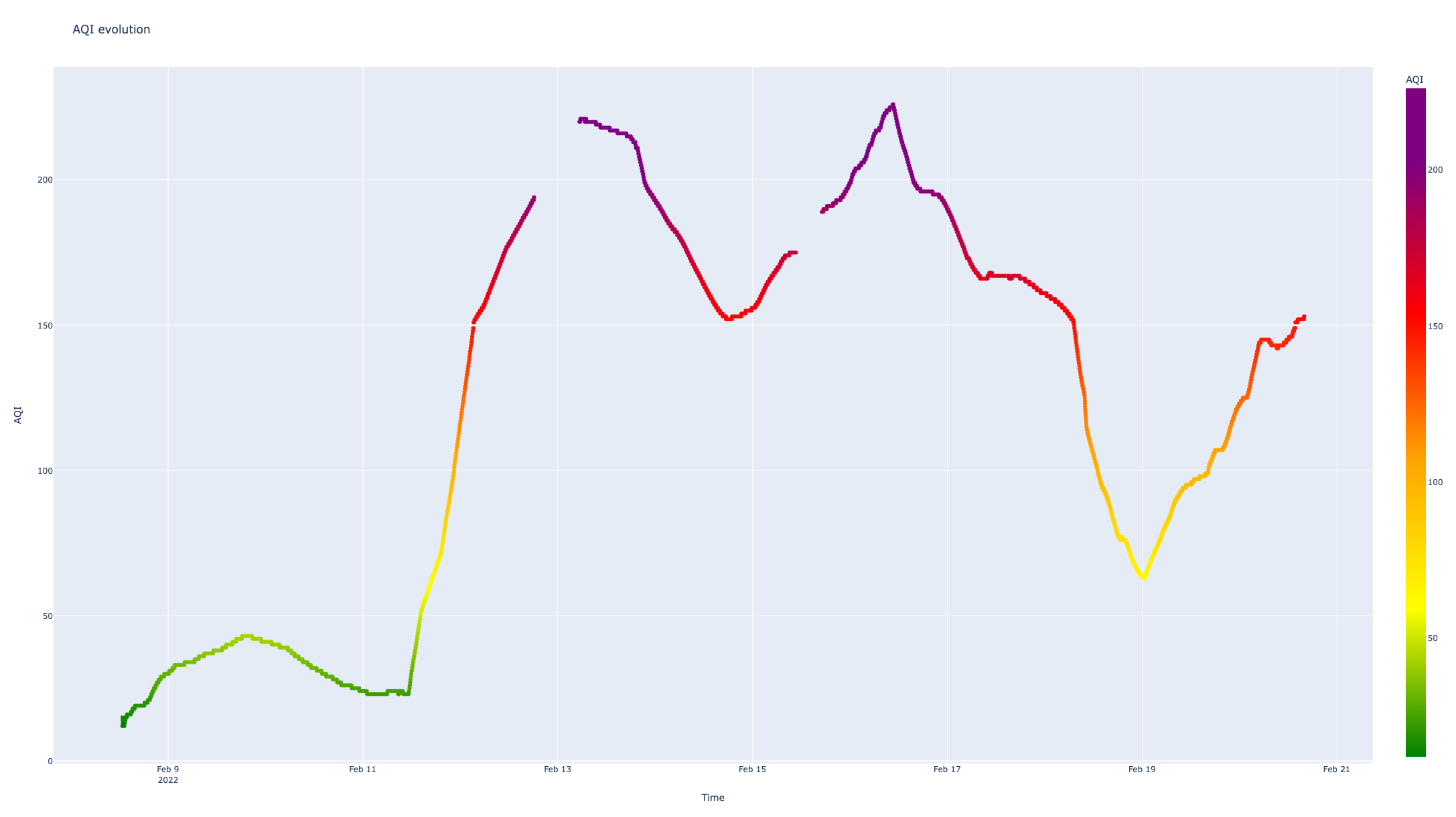
There is a third issue, with the color scale which is not right .. I mean, Plotly tries to map the values into [0,1] interval and allocates the color accordingly, but the scale defined by me was considering the full scale up to AQI 500 – that makes the 226 value to become the “new 500”. This can be fixed by identifying the max AQI value and creating the color scale accordingly.
max_AQI=pData["AQI_24H_calculated"].max()
myscale=[(0, "green"),(0.1, "green"),(0.2, "yellow"),(0.3, "orange"),(0.4, "red"),(0.6, "purple"),(1, "maroon")]
if (max_AQI>300):
     myscale=[(0, "green"),(50/max_AQI, "yellow"),(100/max_AQI, "orange"),(150/max_AQI, "red"),(200/max_AQI, "purple"),(300/max_AQI, "maroon"),(1, "maroon")]
elif(max_AQI>200): # it's only up to purple
     myscale=[(0, "green"),(50/max_AQI, "yellow"),(100/max_AQI, "orange"),(150/max_AQI, "red"),(200/max_AQI, "purple"),(1, "purple")]
elif(max_AQI>150): # it's only up to red
     myscale=[(0, "green"),(50/max_AQI, "yellow"),(100/max_AQI, "orange"),(150/max_AQI, "red"),(1, "red")]
elif(max_AQI>100): #it's only up to orange
     myscale=[(0, "green"),(50/max_AQI, "yellow"),(100/max_AQI, "orange"),(1, "orange")]
elif(max_AQI>50): #it's only up to yellow
     myscale=[(0, "green"),(50/max_AQI, "yellow"),(1, "yellow")]
else:
     myscale=[(0, "green"),(1, "green")]
The result is better, but not an accurate representation of the AQI standard which has a discrete scale and not a continuous one.
The next steps for my analysis:
- validating the data (with other sensors)
- statistics with the AQI value (how many days in the ranges)
- patterns for ambiental noise – air traffic, kids holiday
- noise analysis and seeing if there is any pattern within the days
There are some serious improvements for this solution to become more robust, reliable and more accessible – for example, for flexibility, creating an iOS app to consume the data and display it in an intuitive manner, alerts for air quality sent in the app.
But for now, it served as a good guide to find out more about the air quality measurements, how you can use Python and Pandas for data analysis, Matplotlib and Plotly for data visualisation, remembering some Linux.
References
Enviro+ references:
There is a very interesting YouTube channel – The HWCave – where you can find a detailed two part review of the Enviro+, also a tutorial in 5 episodes on how to build an environment monitoring station. I feel like the channel deserves much more attention than it gets, I was pleasantly surprised by the attention for the details and the fact that one episode was dedicated to the software architecture of the environment monitoring station (the third episode).
- https://www.youtube.com/watch?v=L1kl1kVbmBw [Review part 1]
- https://www.youtube.com/watch?v=d4MCVbEHTlE [Review part 2]
- https://www.youtube.com/watch?v=OgYVuFkQCno [Build environment monitoring station – 1]
- https://www.youtube.com/watch?v=Ors5214cxOM [Build environment monitoring station – 2]
- https://www.youtube.com/watch?v=J1rBug2D1hk [Build environment monitoring station – 3]
- https://www.youtube.com/watch?v=JqQWMx7oOp4 [Build environment monitoring station – 4]
- https://www.youtube.com/watch?v=JgRH3-w18ss [Build environment monitoring station – 5]
Air Quality References
- https://www.airnow.gov/aqi/aqi-basics/
- https://forum.airnowtech.org/t/the-aqi-equation/169
- https://forum.airnowtech.org/t/the-nowcast-for-pm2-5-and-pm10/172
- https://usepa.servicenowservices.com/airnow?id=kb_article&sys_id=bb8b65ef1b06bc10028420eae54bcb98
- https://www.pranaair.com/blog/what-is-air-quality-index-aqi-and-its-calculation/
- https://www.airqualitynow.eu/about_indices_definition.php
Discover more from Liviu Nastasa
Subscribe to get the latest posts sent to your email.

Thank you so much.