I mentioned in one of my previous posts (link) that I have a Enviro+ unit active outside my home, collecting data about the environment, including the noise. All the information is collected in one QuestDB database running in a Docker on a Raspberry Pi 4 and, as long as the power is on and I don’t mess up my network settings, the data just keeps on coming.
Having all this data collected for a bit more than one month, I was just wondering what kind of conclusions can I draw based on the noise collected data – can I make any correlations with external events or night-day cycle?
This journey proved to be fun and a powerful learning experience at the same time. What I discovered:
- pandas is very powerful for data manipulation
- Matplotlib is nice and powerful, even if you need to learn the details – you may go for Plotly or seaborn as options as well
- Google Colaboratory is a great cloud based tool for data analysis
During the analysis, because I had to be flexible and mobile, I couldn’t use only my workstation all the time and that “forced” me to find a solution to be mobile – the data is easily portable, because I can export the sound information in a CSV file, using just a select query and the export feature of the QuestDB. The file is small enough (less than 10MB), so it’s easy to have that with me or cloud accessible.
Since one of the tools I have is a iPad Pro, I thought how can I use that piece of equipment on the go to perform my investigation and analysis. The solution for me was to use Google Colaboratory, which became my best friend for this period, being flexible and allowing me to use the browser in my iPad to complete my analysis.
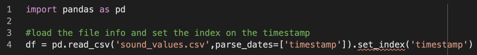
So, after exporting the results of the query into a CSV file, we can easily import the data into a dataframe, parsing the timestamp as a index.
I can check the loaded information to see for anomalies

Since I have one column “location” which doesn’t help me, as I’m collecting data in just one location, I can drop the column and have a slimmer dataframe.

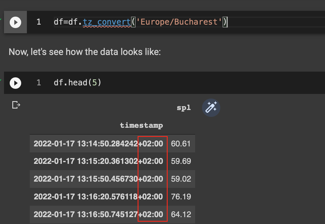
I need to convert the timestamp from GMT to local time (Bucharest), as I’m more interested to correlate the measurements with events in local time instead of GMT.
The reason for the GMT timestamps is the “auto-save” feature of QuestDB I used, since I didn’t bother so much on the timestamp coming from the Enviro+. This is a limitation, which may become more visible when the communication between the Enviro+ and the Raspberry Pi 4 QuestDB is broken for some reason -> if I’d resent asynchronously the data to the database, the new records in the DB will have the timestamp of the saving moment instead of the collection moment.
Therefor, I should generate the timestamp explicitly on the Enviro+ RPi zero instead of being lazy and rely on the database timestamp, even if both Raspberry Pi are NTP synced, but that’s another story.

Let’s have a first look at the data in a visual way, trying to understand how the sound intensity evolves over time.

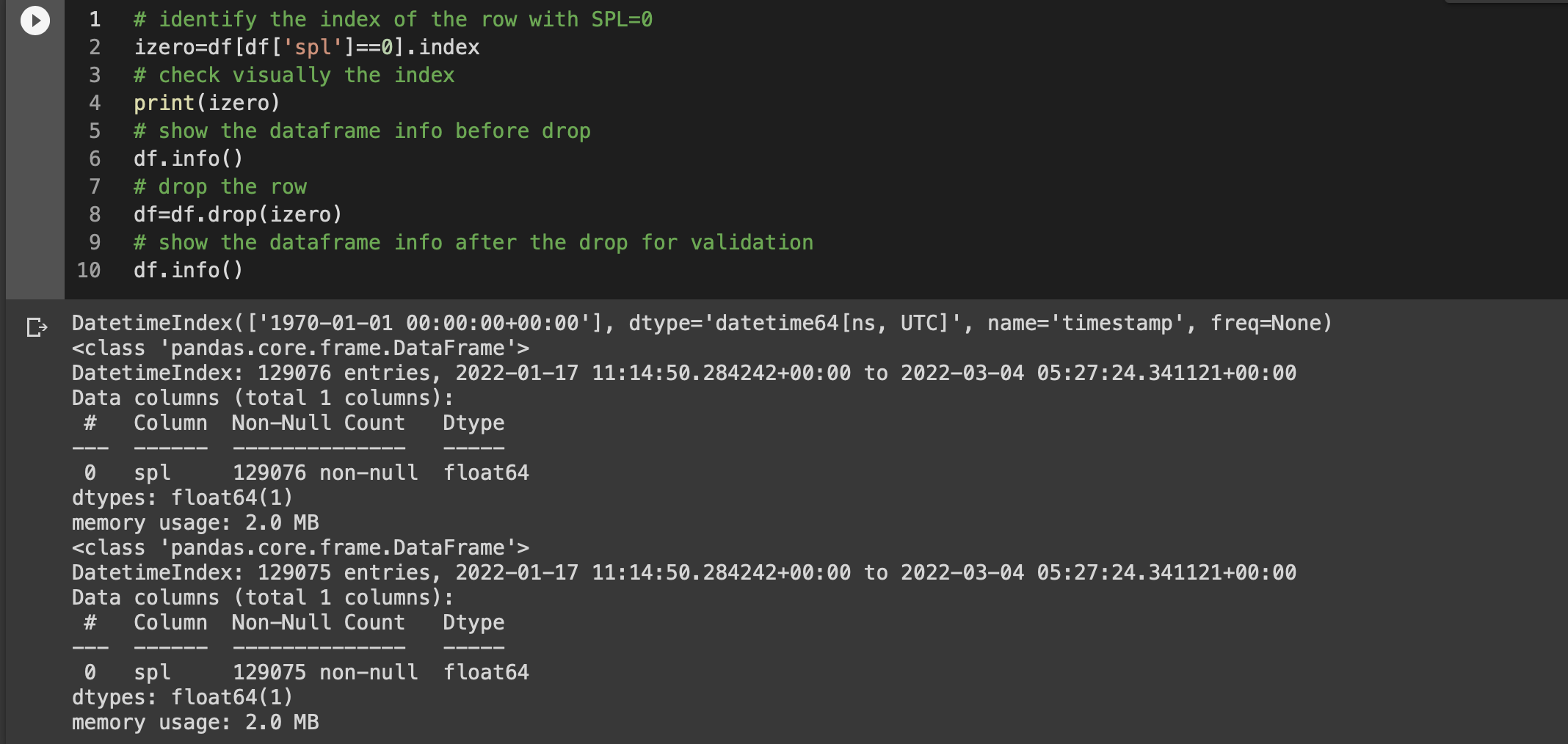
Hmm… that looks strange, I mean it looks like there is at least one record with the default timestamp (1970) – a data anomaly. Let’s look in more detail then..
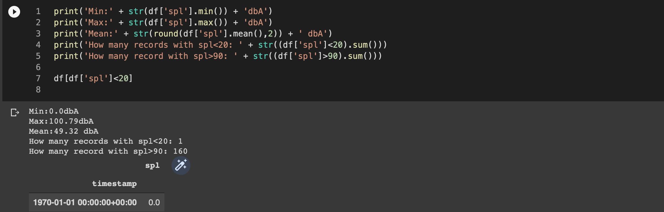
Because the record doesn’t provide any meaningful information, but probably represents a glitch when the saving happen in the QuestDB after a restart (the timestamp doesn’t come from the Enviro+), I’ll delete that record.
Now, let’s try once again to look at the data
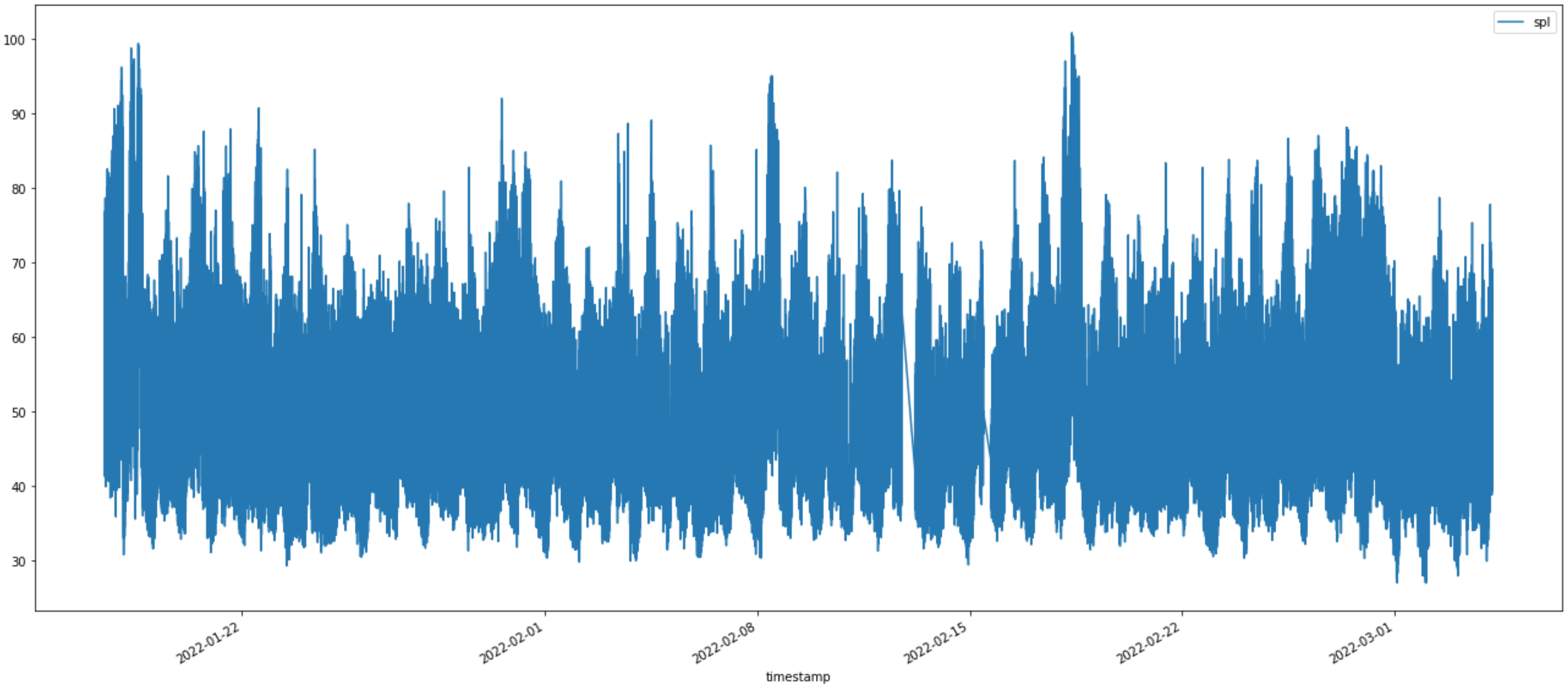
Just looking at the chart above, a conclusion is difficult. You can see two continuity gaps [13th and 17th of Feb] in the data, I’m aware of those – I lost the data because the sensors were off and my WiFi network was reconfigured during those two intervals. For increased robustness, I should define the timestamp on the origin Enviro+ and save the data locally on my Raspberry Pi Zero until the QuestDB database is available. At the moment, the timestamp is generated by the QuestDB and even the saved data on the RPi Zero won’t change things, actually it would make things worse.
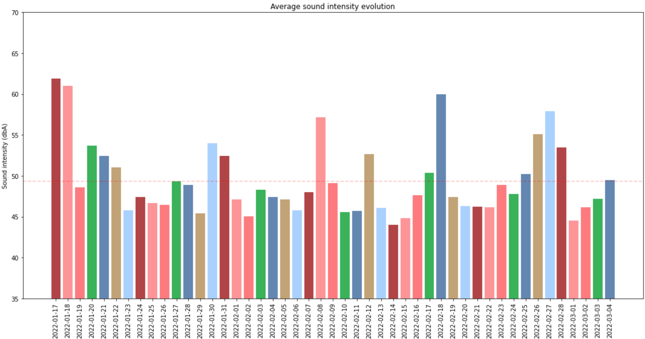
Since the chart is not that useful, let’s have a look at the daily min, max and average values – maybe that’s more interesting.

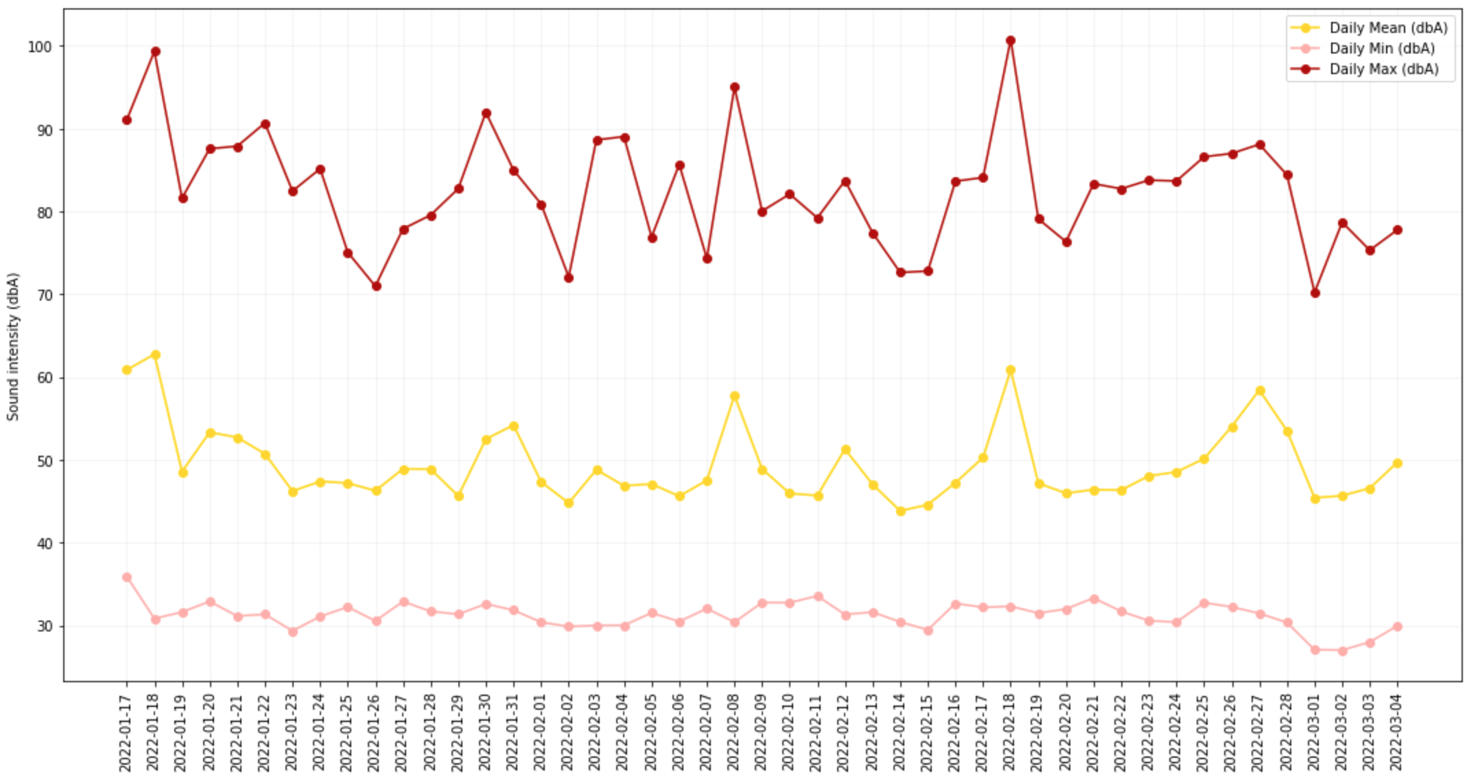
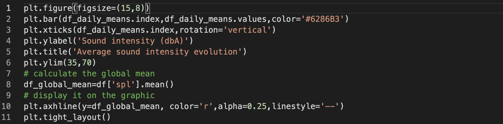
Let’s see if looking at the average daily value we can see some patters or at least a meaningful evolution:

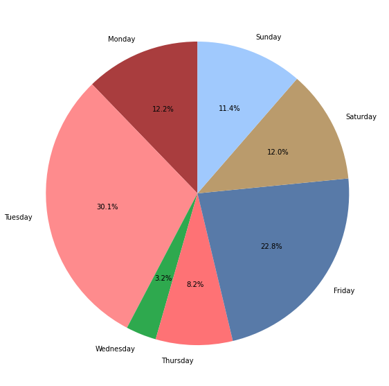
An alternative to the above view would be to have color code for each day of the week, but that’s making the chart more colourful and nothing more. The change comes from the fact that instead of using one color in the bar, you can define a list of 7 colors that would be cycled for display
color_days=['#B34344','#FF9496','#FF7A7D','#32B355','#6286B3','#C2A474','#A9D0FF']
plt.bar(df_daily_means.index,df_daily_means.values,color=color_days)
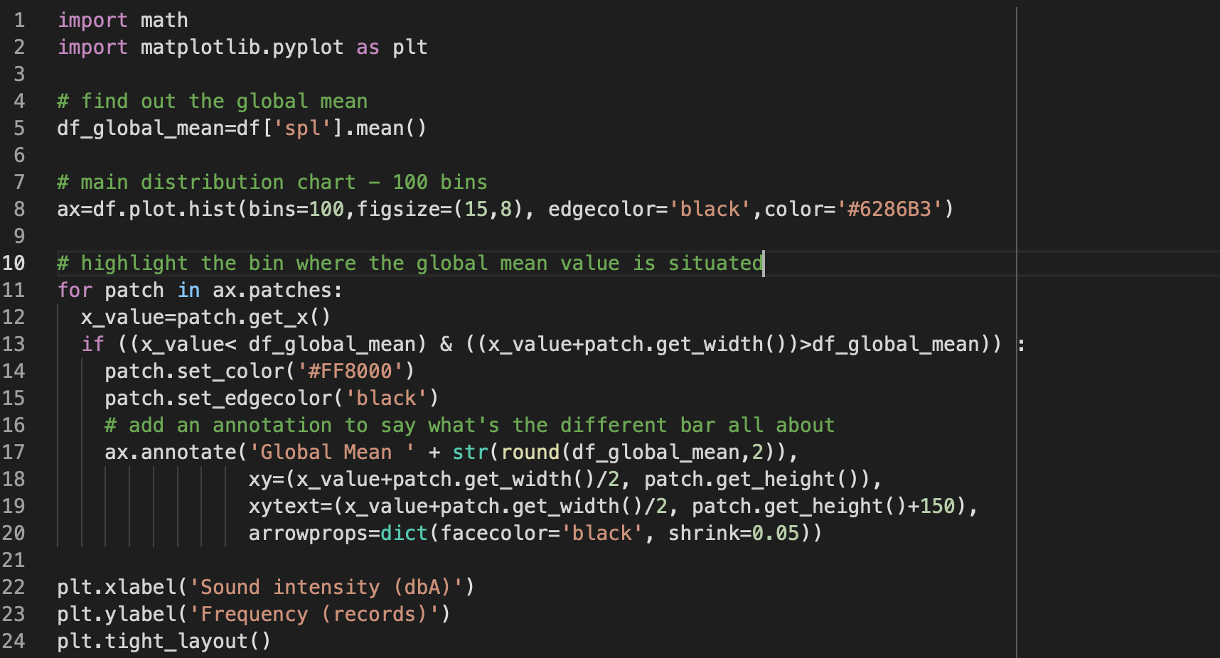
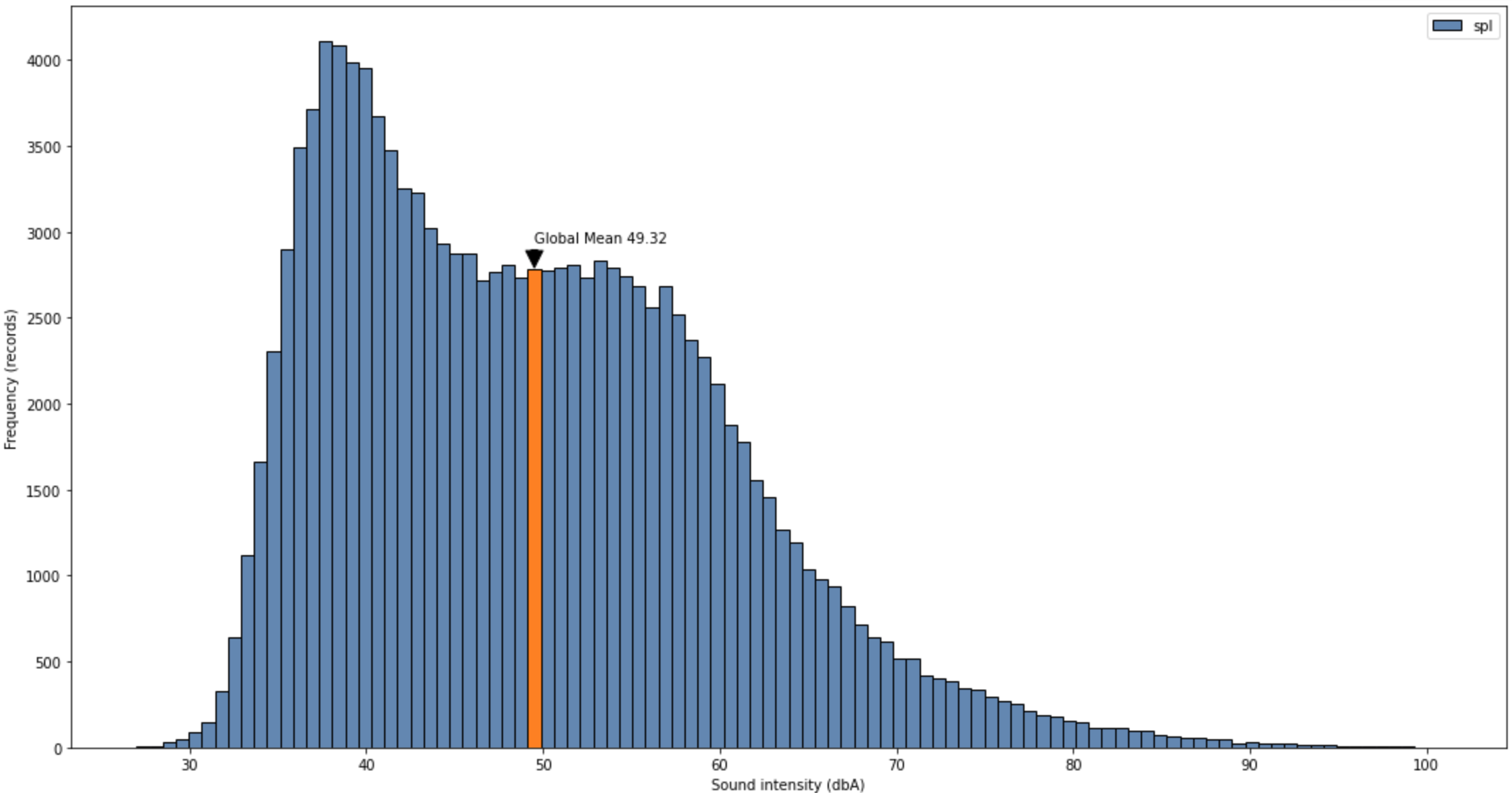
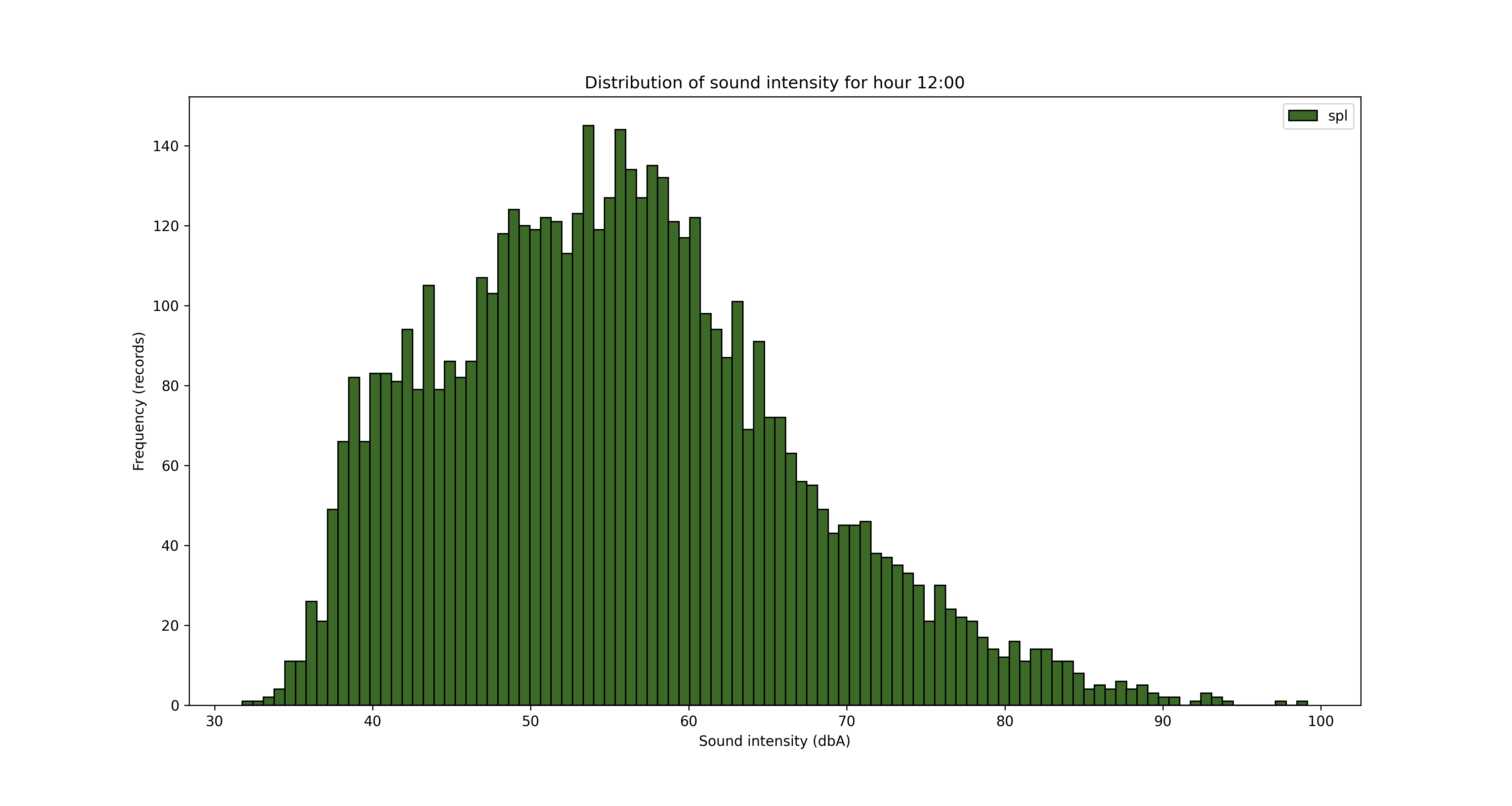
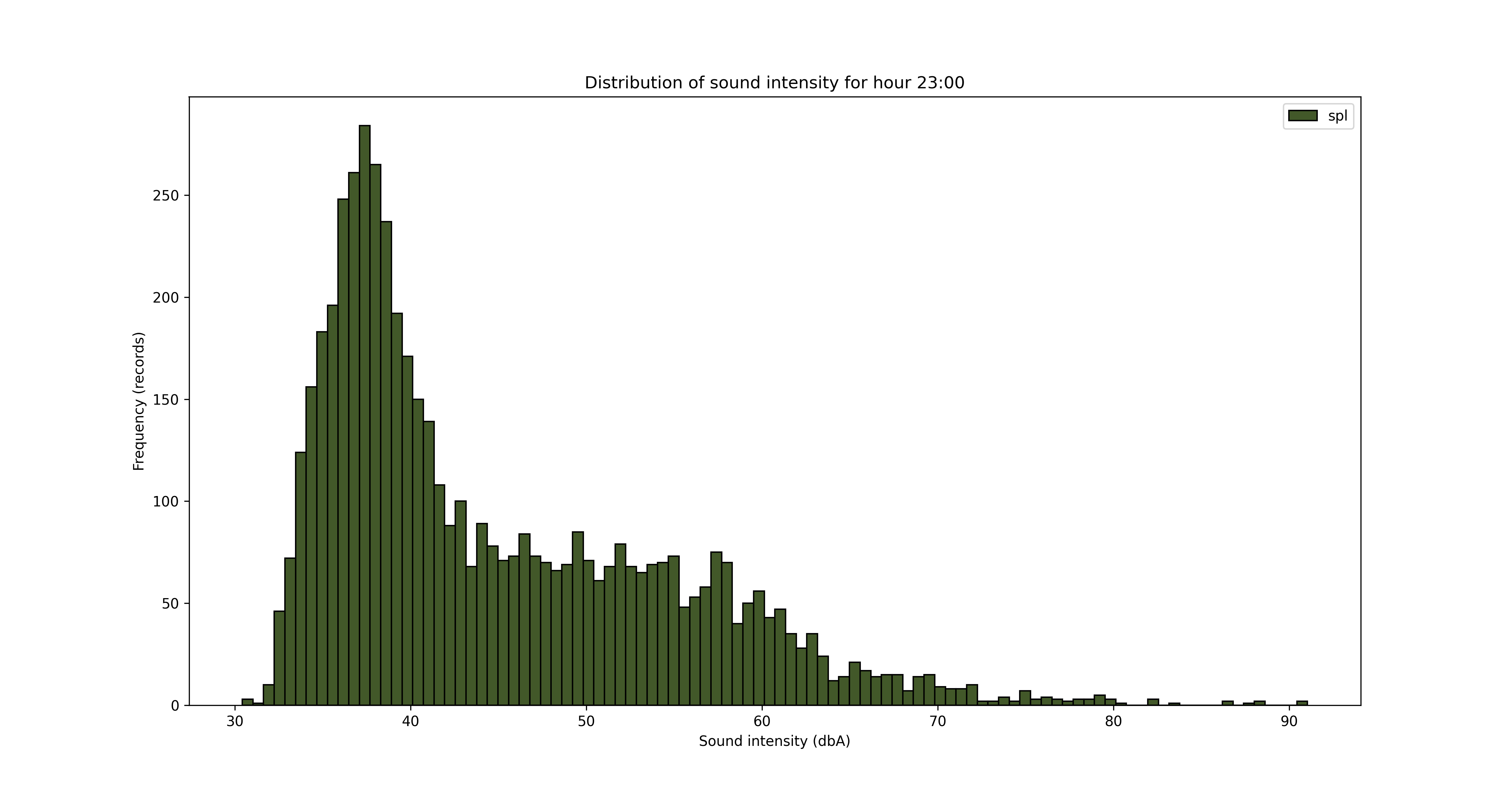
It might be interesting to have a look at the distribution of sound intensity values (dbA) across all the dataset
The result is below
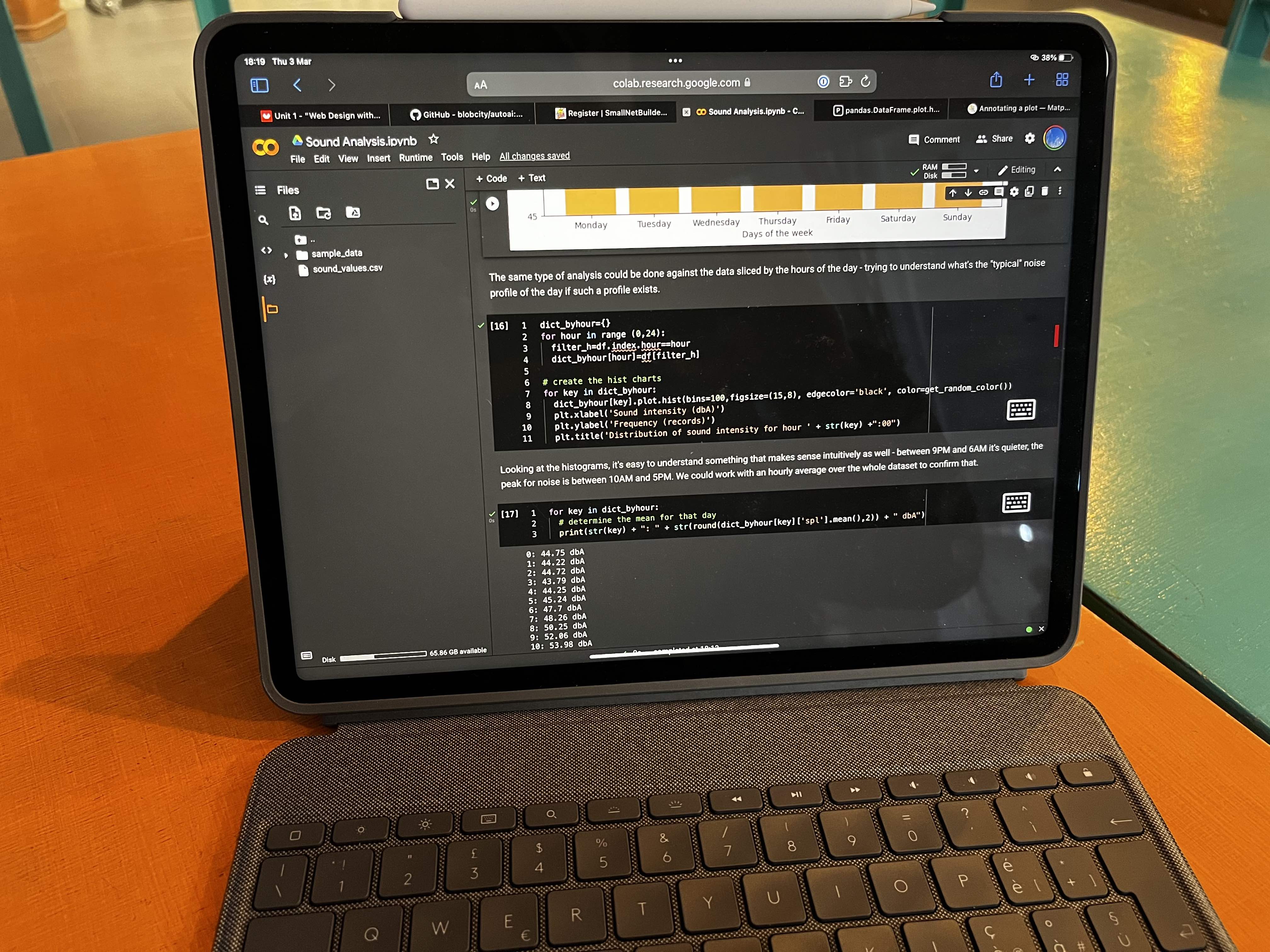
It would be interesting to understand if there are specific patterns in sound intensity when looking at the days of the week (is there a “silent” day and a “noisy” day?) or in the hours of the days (for example is morning quieter than evening, does the sound pollution decreases by night?).
To answer the first quest, I need to slice the data first into dataframes specific for days of the week and create specific histograms for each day.

An alternative to using the random color (which sometimes might not be the right one, is to use a palette with the right contrasts for those 7 colours).
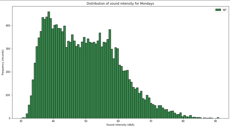

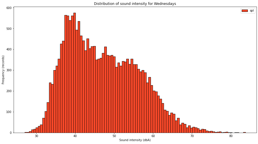
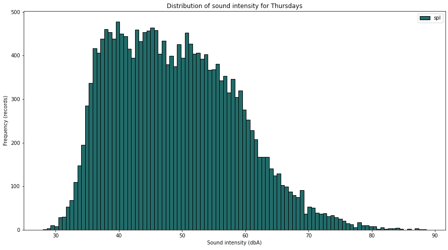
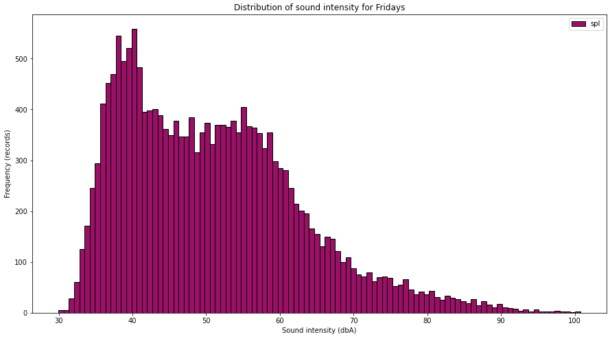
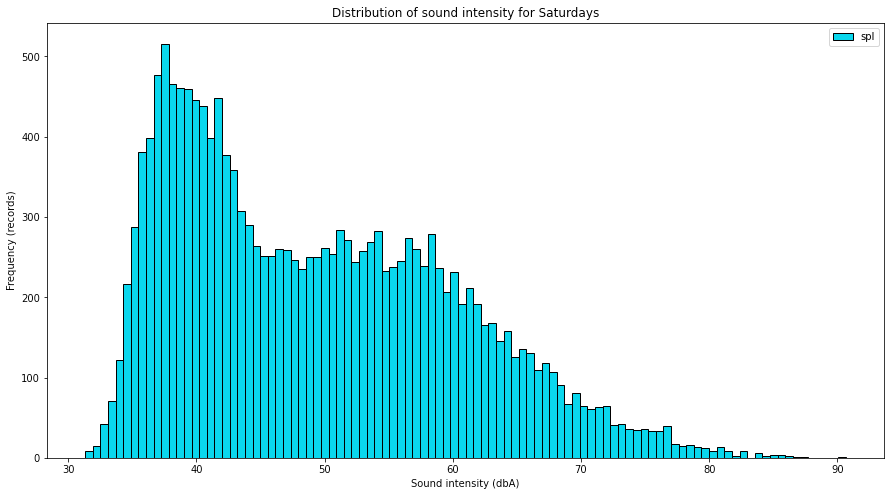

Glancing through the charts, you can see that there is a difference between days, suggesting that some of them are quieter than the rest. Maybe we can look into the averages of the days of week.

If we would like to see that information more intuitive, we can use a bar chart

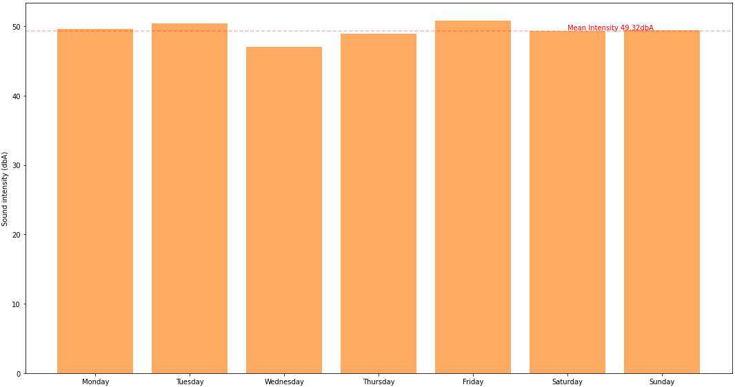

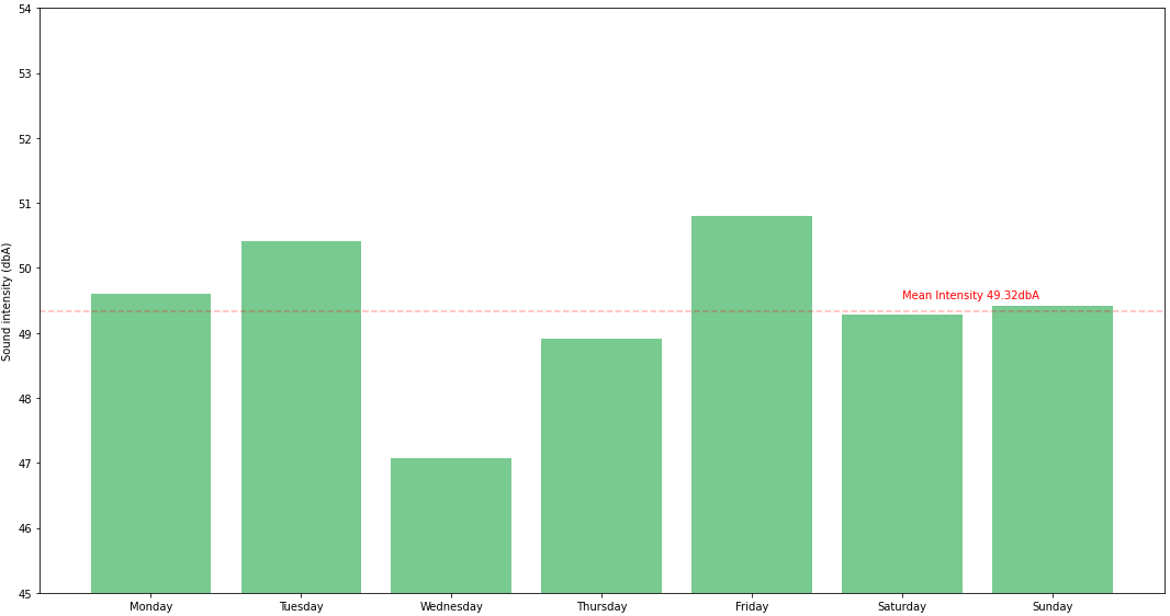
Tuesdays and Fridays are noisier because I know I live near an airport and their activity is more intense during Tuesday and Friday, so that’s not a surprise .. maybe the fact that Wednedays and Thursdays are quieter than weekend days is somehow interesting. Maybe collecting data for a longer period of time will change that or confirm it .. for now, the dataset is still small to draw definitive conclusions.
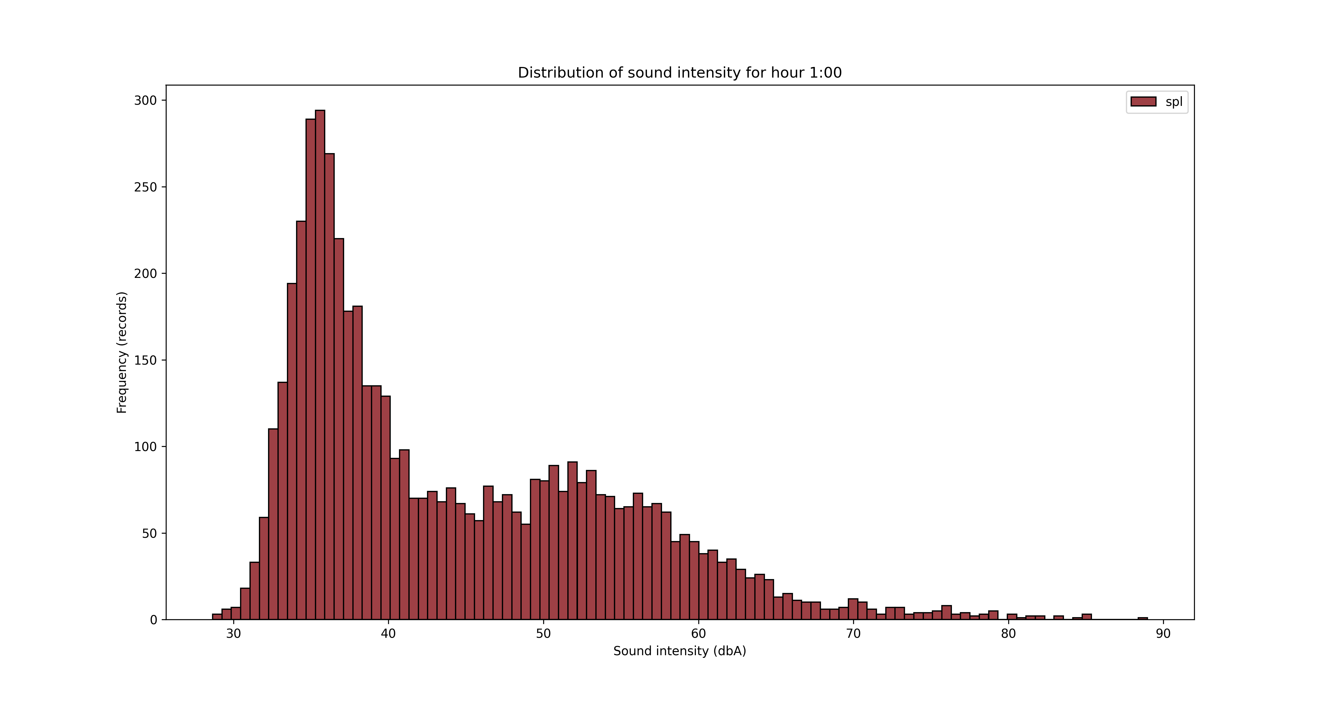
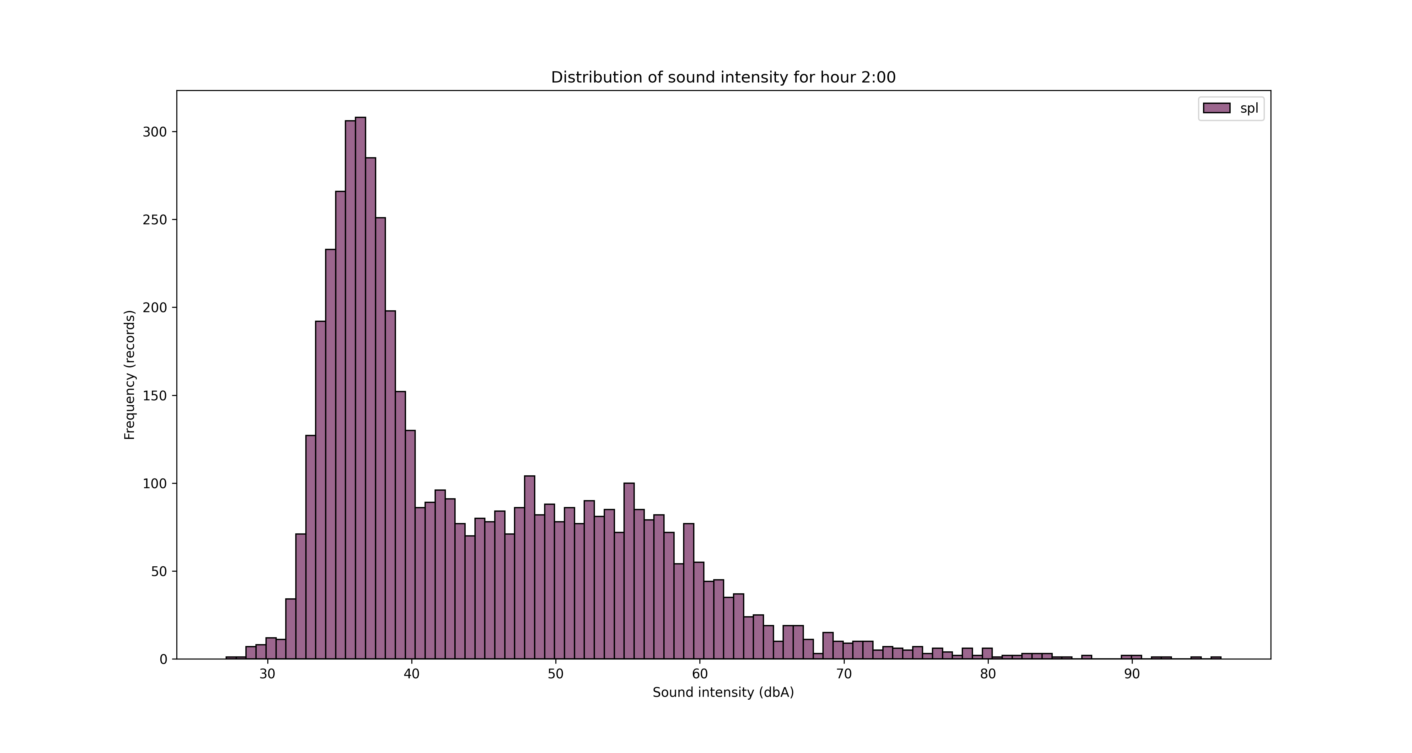
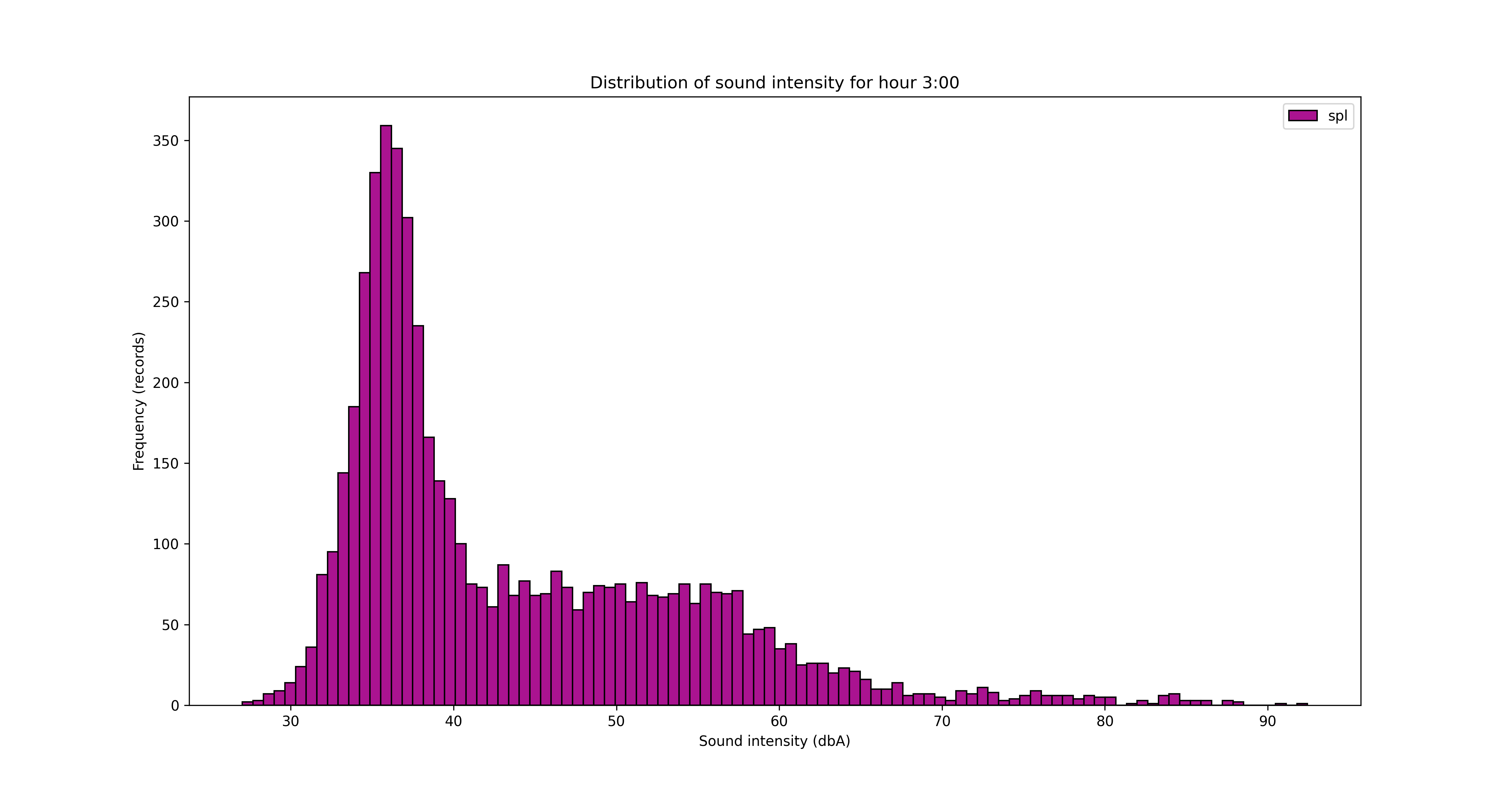
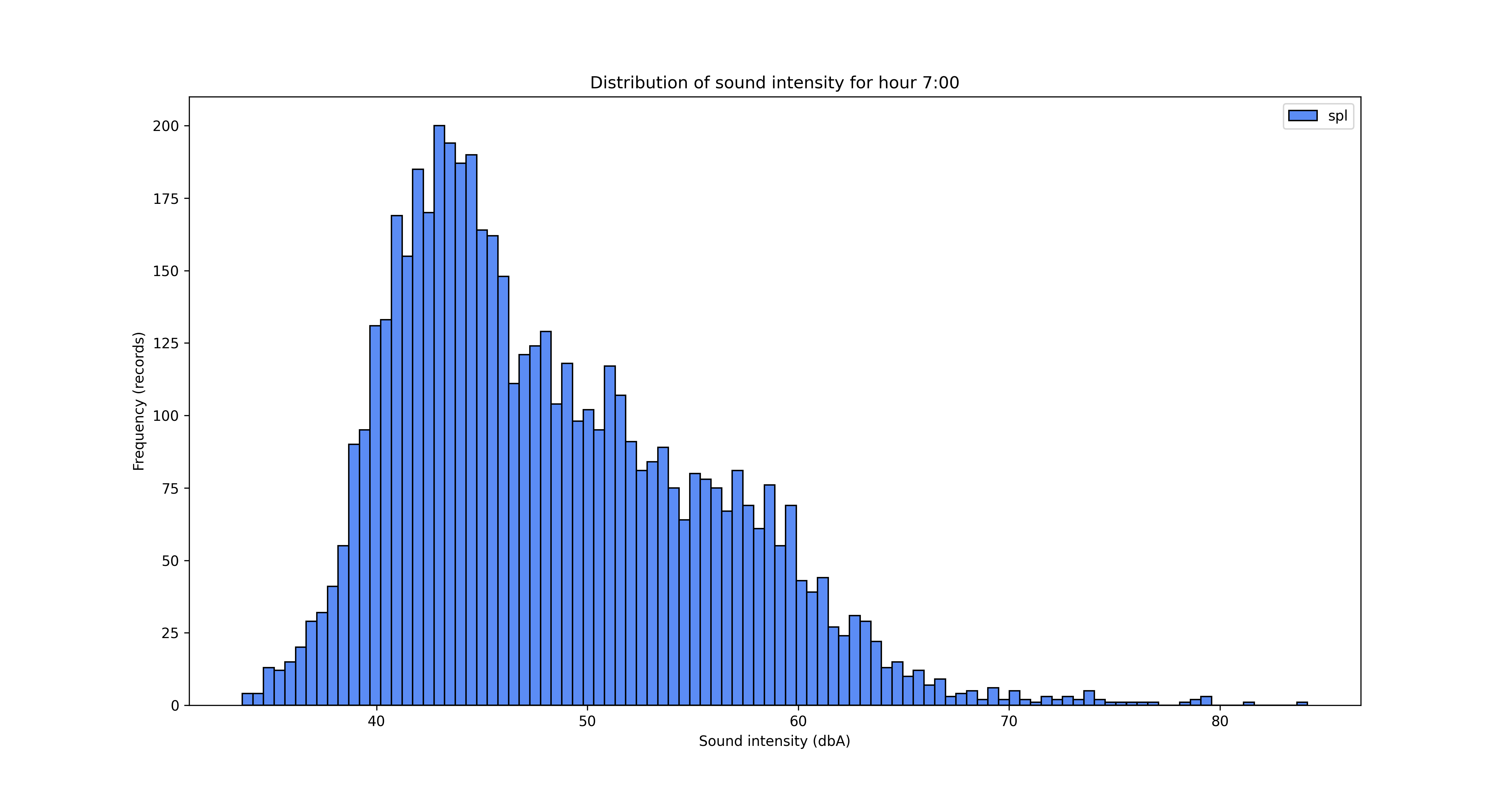
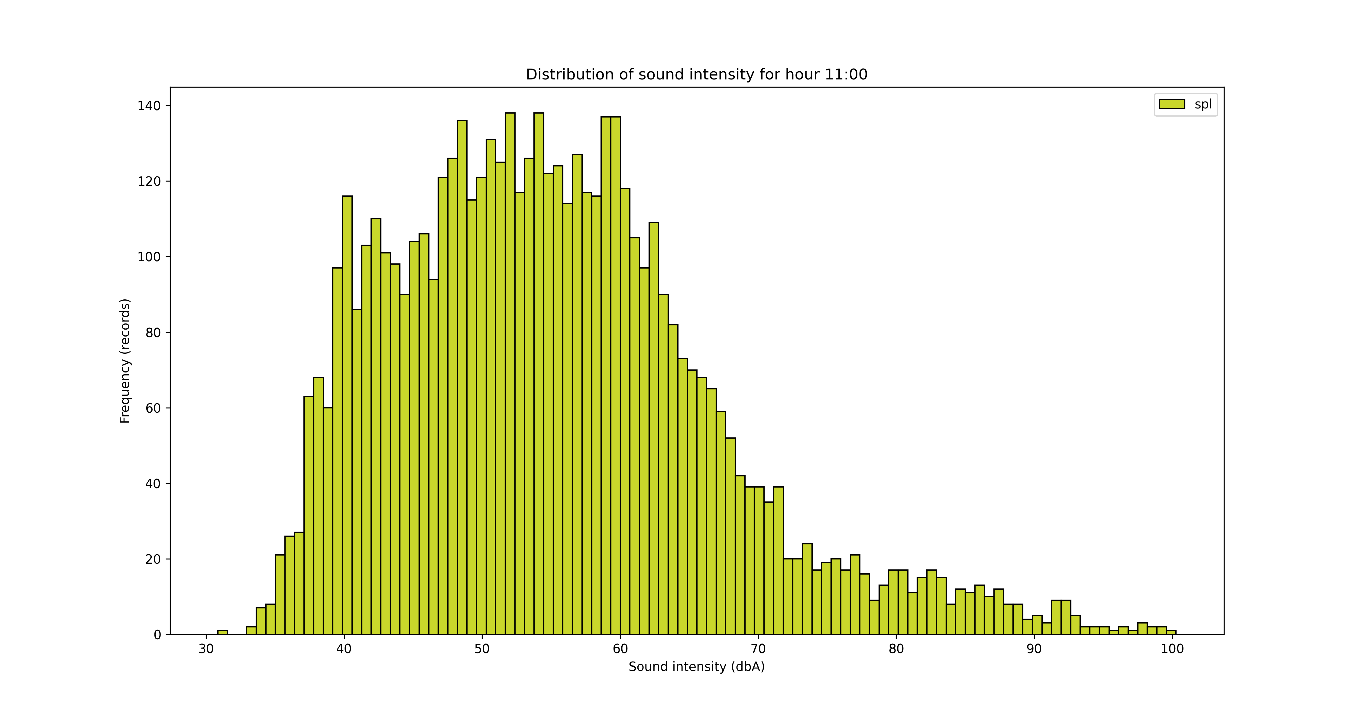
Another angle for the analysis is looking at the data from hours of the day perspective.


To save/export the charts, you can add a line of code in the for loop
plt.savefig('sound_' + str(key)+'.png', dpi=300, format='png')
It’s obvious from the charts above that the night is quieter and the noise increases during the day, with an expected peak between 12pm and 5pm. But let’s see that somehow, with some averages by hour of the day.


With this chart, the evolution becomes more clear with the noise increasing during the day. Obviously, the evolution may differ for each day of the week, but I don’t expect this to be so much different from day to day. We can reuse some of the ideas we employed when we sliced data by weekday.

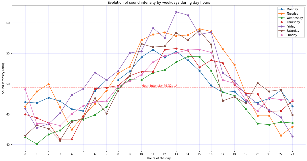
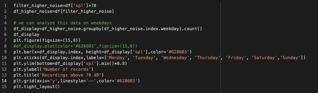
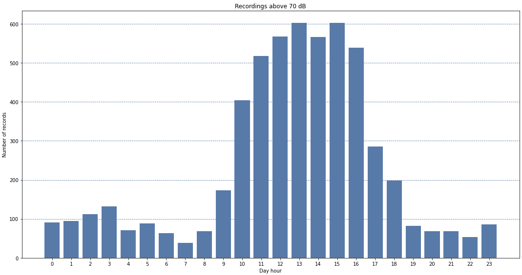
I was just wondering about the higher intensity sound values – how those are distributed on weekdays if that makes sense, because it appears that the higher noise is during the day between 10am and 4pm generally.
In the context of sound pressure chart below, we might be interested what days or hours are contributing more to the “higher noise”
| decibels | type of sound |
|---|---|
| 130 | artillery fire at close proximity (threshold of pain) |
| 120 | amplified rock music; near jet engine |
| 110 | loud orchestral music, in audience |
| 100 | electric saw |
| 90 | bus or truck interior |
| 80 | automobile interior |
| 70 | average street noise; loud telephone bell |
| 60 | normal conversation; business office |
| 50 | restaurant; private office |
| 40 | quiet room in home |
| 30 | quiet lecture hall; bedroom |
| 20 | radio, television, or recording studio |
| 10 | soundproof room |
| 0 | absolute silence (threshold of hearing) |
| Source Britannica |
If we are interested in the contribution of weekdays for higher level noise (above 70dB), we could filter the data and see a bar chart with the number of records from each weekday.


The same analysis can be performed from the hour of the day perspective, filtering the noise level and then looking to separate that by hours.

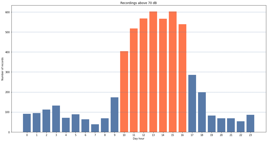
We could play with the visual representation to highlight the bars that are above 400 records for example, but changing the color of the rectangles where their height is above 400.
colors_bar=[]
for rec in df_display['spl']:
  if rec>400:
    color='#FF7F50'
  else:
    color='#6286B3'
  colors_bar.append(color)
Even though the analysis didn’t provide unexpected insights – night is quieter, mid day is noisier, I was very happy to play with the data in various ways and it’s an opportunity for everyone who has some data to learn more about the pandas and Matplotlib. Sure, there are multiple other libraries and opportunities to learn, I’ll come back to this data for cyclicity and other insights.
Be well and enjoy your learning experience, try pandas and Matplotlib !
Discover more from Liviu Nastasa
Subscribe to get the latest posts sent to your email.
