In the recent days there was a message distributed massively through WhatsApp regarding a toxic cloud which was supposed to be cover Romania, as a result of the war in Ukraine and the strong wind expected especially during Tuesday. The authorities flagged this a being fake news and provided data from the Meteo Romania and Copernicus Atmosphere Monitoring Service, but since I’m collecting some data with my Enviro+ sensors, I thought of looking over the data registered home.
That doesn’t say that the values recorded by the Enviro+ board are reference values, but I was just trying to understand if there is any deviation from the previous evolution for two indices – the CO and NO2, those being available on the Enviro+ board. The Enviro+ has a MiCS-6814 sensor able to detect the pollution from automobile exhausts and industrial odors. More details about the sensor are available here.
Regarding the accuracy of the sensor in common use, Pimoroni actually makes the following statement on their website: The analog gas sensor can be used to make qualitative measurements of changes in gas concentrations, so you can tell broadly if the three groups of gases are increasing or decreasing in abundance. Without laboratory conditions or calibration, you won’t be able to say “the concentration of carbon monoxide is n parts per million”, for example.
Using the data available on the sensor website, you can try to “reverse engineer” and get some values (estimates) like the concentration of carbon monoxide.

For example, looking at the chart above, you could “say” that
reducing_in_ppm = math.pow(10, -1.25 * math.log10(gas_data.reducing/red_r0) + 0.64)
where red_r0 is 200000.
With this assumption in mind (and similar for NO2 and NH3), my data collected for NO2, CO and NH3 coming from the sensor is stored in ppm values in the QuestDB database.
Looking at the evolution of data during March 2022, I don’t see any changes in the recent days.
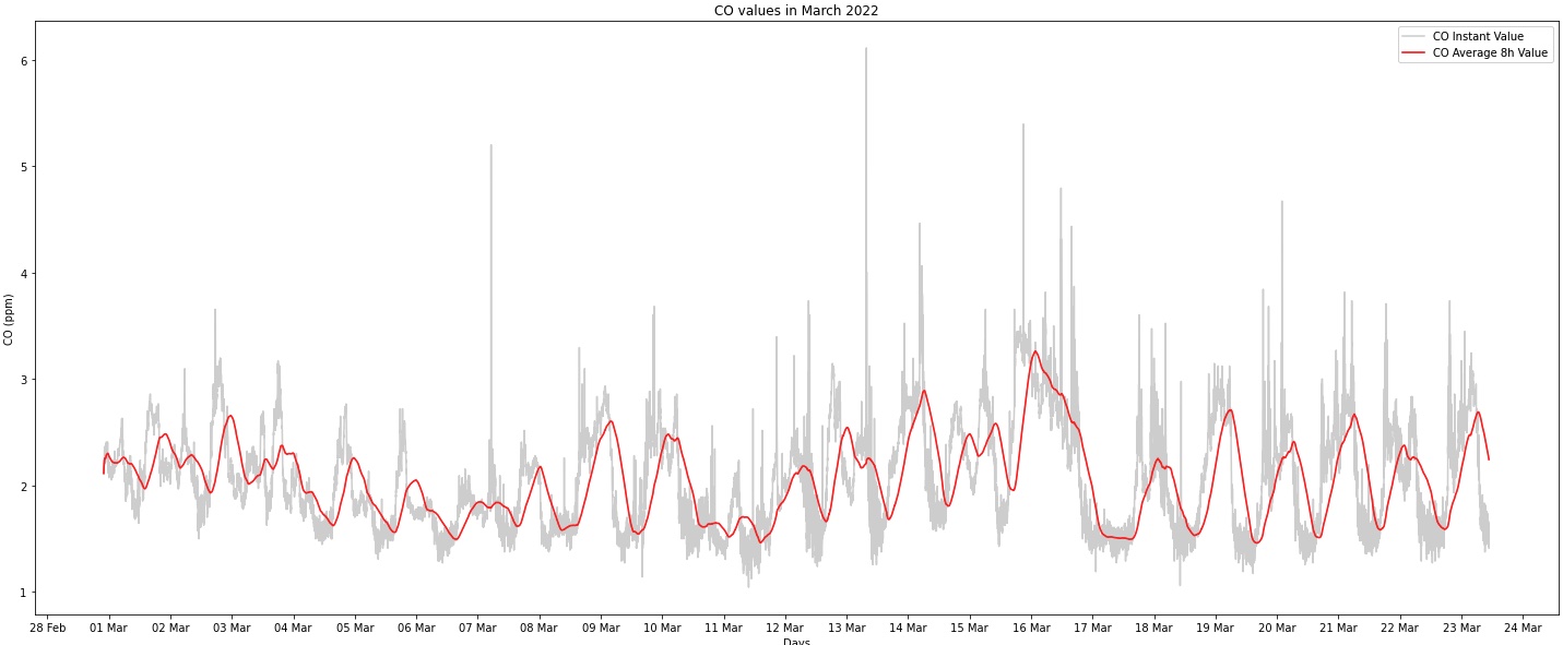
The reason I was interested in the average 8 hour values of the CO concentration is the fact that AQI has this approach when looking at the sub-indices values of AQI. More details are available in the document available here https://www.airnow.gov/sites/default/files/2020-05/aqi-technical-assistance-document-sept2018.pdf
According to that document, the Good AQI index [0-50] corresponds to 0-4.4 ppm CO 8h, which seems to be the case for the data I collected locally.
The 8h rolling average can be easily calculated using Pandas and defining a new column, based on the “reduced” column values.
thisMarchData["co_8h_avg"]=thisMarchData["reduced"].rolling('8H').mean().values
Based on what I see, this is a confirmation of the fact that the message distributed via WhatsApp is fake news meant to create panic.
I looked also at the NO2 values and what happened with the values during the last 48 hours – apparently nothing unusual.

You may see on the chart a threshold at 54 ppm – there is the limit between Good and Moderate values according to AQI index, so basically what the chart says is that the values for NO2 are not always in the Good area (as with the CO values), but some of the time is in the Moderate area. For March 2022 (until 23rd mid day), the average value is 58.09, above the Moderate threshold of 54. If you take into account the rolling hourly average value, 68.52% of the values (and due to the uniform distribution of the readings, that applies to the time/duration) are above the Moderate threshold and only 31.48% in the Good area.
That means that most probably I’ll spend more time trying to understand the data and validate the information with third party sensors eventually. I understand that one of the limits of my deductions is the way I’m choosing to get the gas measurements – that needs more investigation for the moment.
That’s the beauty for working with data .. it’s only getting more interesting as you dig deeper.
Discover more from Liviu Nastasa
Subscribe to get the latest posts sent to your email.

5 thoughts